
The Janusian tableau of the mega-shed/front office industrial building is a common sight in this part of the world.
Reflecting pervasive, cost-conscious attitudes, the schemes are often a comical shunting of utilitarian design into a modern rear end, almost entirely irreconcilable in language and character.
Malaysian practice Gibert&Tan, who was tasked with designing a headquarters and warehouse, decided that the only way to address these dichotomic qualities was to embrace them, and specifically on their terms.
PRACTICAL, FUNCTIONAL, BALANCED
“ECT is one of Malaysia’s leading independent chemical distributors. What they wanted first was a building that was practical and fairly easy to maintain.
“Functionality was important to the owner, so the design, I would say, is straightforward overall; warehouse at the back, main office out front,” says architect Michael Gibert, a 20-year veteran who, for several years, had been based in Kisho Kurokawa’s office.
“By looking at the orientation of the plot, entry points and logistics, these are what defined the location of the warehouse, delivery bay and how you access the site.”
The front office’s role as a representation of the company invariably creates the schism inherent in this industrial milieu.
“In this project, Gibert&Tan reframes the notion of a warehouse headquarters.“
Rather than fight it, Gibert opts for acceptance, “When I was looking at that (the office), one of my priorities was not to lie, meaning the design had to remain honest by reflecting the geometry of the warehouse roof.
“It’s a totally different approach, different from the typical boxes you see in this kind of context,” he says, alluding to the office’s unconventional asymmetric silhouette.
هذه القصة مأخوذة من طبعة Issue 120 من d+a.
ابدأ النسخة التجريبية المجانية من Magzter GOLD لمدة 7 أيام للوصول إلى آلاف القصص المتميزة المنسقة وأكثر من 9,000 مجلة وصحيفة.
بالفعل مشترك ? تسجيل الدخول
هذه القصة مأخوذة من طبعة Issue 120 من d+a.
ابدأ النسخة التجريبية المجانية من Magzter GOLD لمدة 7 أيام للوصول إلى آلاف القصص المتميزة المنسقة وأكثر من 9,000 مجلة وصحيفة.
بالفعل مشترك? تسجيل الدخول
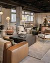
Tailored For The Curious Explorer
The new Alma House at the New Bahru enclave reflects the collaborative spirit of a school environment.
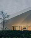
Eco And Egalitarian
Can a building represent a culture? Berrel Kräutler Architekten's sensitive renovation of the Embassy of Switzerland in Singapore stimulates discourse.
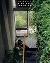
Building A Green Home
This semi-detached house by Zivy Architects explores passive tropical design, the delight in architecture and the issues of multi-generational living.
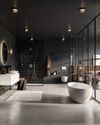
The Natural Balance
Inspired by the serene beauty of dewdrops, the Antao Collection by Villeroy & Boch transforms bathrooms into wellness sanctuaries, combining sustainability with timeless elegance.
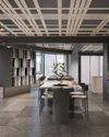
Inspiring Creativity And Exploration
The new Hafary House at Lavender reflects the brand’s vibrancy and innovation, as well as provide an inspiring and engaging space for customers.
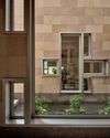
Home Is Where The Heart Is
A vacation house is reimagined for a multi-generational family to gather for holidays in the bucolic setting of Yongjia in Zhejiang, China.
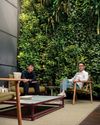
balancing act: nature and humanity
In this inspiration-led series, we asked Jay Liu and Alex Liu, co-founders of Right Angle Studio, to dream up a unique interior concept using mainly items from Space Furniture.

rethinking, remaking, reframing
Aoki Akio, the founder of DESIGNART TOKYO discusses the importance and legacy of Tokyo's eminent art and design event, particularly for young creatives.

rebuilding communities
Shift2024, the much-anticipated conference returns with a stellar line-up of prolific architects making their mark in Asian urban design.

unparalleled italian craftsmanship
Filippo Arnaboldi, Chief Executive Officer of Frette, tells us how this luxury lifestyle Italian brand is moving forward with times yet not forgetting about its existing legacy.