
Woodblock is a type of relief printing. In woodblock prints, the surface of the material is used to make the print and the cut-away areas do not register. Below is a simple, two-block project that is a good starting point for anyone who wants to explore basic woodblock printing. It includes instructions for making a jig to line up the two woodblocks for accurate printing.
First, I want to talk you through the materials you will need.
PAPER
To transfer designs, you need tracing paper and carbon paper (standard office carbon paper works well). Initial rubbings can be made on thin, cheap paper – blank newsprint paper is ideal – while test prints can be made on slightly thicker printer paper.
For your final prints, you will need a good quality printing paper: a wide range of papers will work, smooth papers are best. Japanese washi papers under 150gsm are particularly good for hand printing.
INKS
For this project you will need at least two colours of ink. For best results, it is important to use relief printing ink. There are three types of relief printing inks available: water-based inks, oil-based inks, and oil-based inks that can be cleaned in water (often called “safe wash” inks). All three types of ink will work for this project. Water-based ink gives fast results, but safe-wash and traditional oil-based inks are easier to use.
MATERIALS
This woodblock print requires two types of wood. The background needs a piece of softwood with a visible grain, such as pine, larch or cedar – I used a roof shingle here. A second piece is needed to cut details: shina plywood is ideal. It is sometimes called Japanese ply or Asian ply.
هذه القصة مأخوذة من طبعة March 2021 من Artists & Illustrators.
ابدأ النسخة التجريبية المجانية من Magzter GOLD لمدة 7 أيام للوصول إلى آلاف القصص المتميزة المنسقة وأكثر من 9,000 مجلة وصحيفة.
بالفعل مشترك ? تسجيل الدخول
هذه القصة مأخوذة من طبعة March 2021 من Artists & Illustrators.
ابدأ النسخة التجريبية المجانية من Magzter GOLD لمدة 7 أيام للوصول إلى آلاف القصص المتميزة المنسقة وأكثر من 9,000 مجلة وصحيفة.
بالفعل مشترك? تسجيل الدخول

Still life IN 3 HOURS
Former BP Portrait Award runner-up FELICIA FORTE guides you through a simple, structured approach to painting alla prima that tackles dark, average and light colours in turn
Movement in composition
Through an analysis of three masterworks, landscape painter and noted author MITCHELL ALBALA shows how you can animate landscape composition with movement
Shane Berkery
The Irish-Japanese artist talks to REBECCA BRADBURY about the innovative concepts and original colour combinations he brings to his figurative oil paintings from his Dublin garden studio
The Working Artist
Something old, something new... Our columnist LAURA BOSWELL has expert advice for balancing fresh ideas with completing half-finished work
Washes AND GLAZES
Art Academy’s ROB PEPPER introduces an in-depth guide to incorporating various techniques into your next masterpiece. Artwork by STAN MILLER, CHRIS ROBINSON and MICHELE ILLING

Hands
LAURA SMITH continues her new four-part series, which encourages you to draw elements of old master paintings, and this month’s focus is on capturing hands

Vincent van Gogh
To celebrate The Courtauld’s forthcoming landmark display of the troubled Dutch master’s self-portraits, STEVE PILL looks at the stories behind 10 of the most dramatic works on display
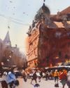
BRING THE drama
Join international watercolour maestro ALVARO CASTAGNET in London’s West End to paint a dramatic street scene
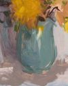
Serena Rowe
The Scottish painter tells STEVE PILL why time is precious, why emotional responses to colour are useful, and how she finds focus every day with the help of her studio wall

Bill Jacklin
Chatting over Zoom as he recovers from appendicitis, the Royal Academician tells STEVE PILL about classic scrapes in New York and his recent experiments with illustration