
Style-wise, the couple preferred something contemporary. “We find the industrial style too heavy and Scandinavian, too minimalist; something in-between would be perfect,” says Timothy, who is in his early 30s and works in the legal field. He and Elaine, a nurse in her late 20s, did not want a monotone interior, so they were very excited when Ruth’s proposal incorporated colours.
“I love colours and like to experiment with contrast. They add depth and character to a design when complemented by the right details, finishings and other decorative elements,” says Ruth.
For example, the entrance and the living and dining areas may serve different functions, but they come across as one seamless space. A small, circular, mustard-coloured seat at the entrance contrasts with the deep green wall, and it is part of a series of builtin cabinets and top-hinged storage compartments that continue along the living room’s back wall.
هذه القصة مأخوذة من طبعة October 2021 من Home & Decor Singapore.
ابدأ النسخة التجريبية المجانية من Magzter GOLD لمدة 7 أيام للوصول إلى آلاف القصص المتميزة المنسقة وأكثر من 9,000 مجلة وصحيفة.
بالفعل مشترك ? تسجيل الدخول
هذه القصة مأخوذة من طبعة October 2021 من Home & Decor Singapore.
ابدأ النسخة التجريبية المجانية من Magzter GOLD لمدة 7 أيام للوصول إلى آلاف القصص المتميزة المنسقة وأكثر من 9,000 مجلة وصحيفة.
بالفعل مشترك? تسجيل الدخول

Building Spaces, Relationships, And Trust
Adrian Heng of Space One ID talks design evolution, his experiences in the industry, and the home that sparked his love for interior design.

Glow By Supernature
A refreshing and immersive retail and dining experience for daily health and wellbeing needs.
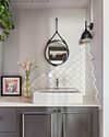
On-Trend Options To Consider
Small as it may be when compared to the rest of the home, the bathroom deserves pride of place because it is one place you can truly be on your own. So why not make it look spectacular with these touches.
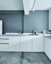
Cabinet Layout Ideas For An Open-Concept Kitchen
Breaking away from traditional enclosed cabinetry, these cabinet ideas offer a unique and refreshing approach that blends openness with functionality.

From Trash To Treasure
Designer Karyn Lim recounts her experience of creating the So Plast!c collection for the Designers & Crafters Edition 01 showcase co-curated by Industry+ and Sol Luminaire.
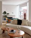
COOL VIBE IN MANHATTAN
Rising interior designer Matt McKay shares with KARINE MONIE how he drew inspiration from the 1960s and French design to create this apartment in Manhattan's West Village.
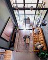
CITY LOFT
This bachelor pad feels like a Manhattan loft with its high ceiling, dark colour palette and a slight industrial edge.
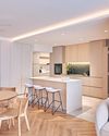
ROOMS FOR GROWTH
Smart lighting, minimalist material palette and clever spatial tweaks come together to create a cosy home with thoughtful considerations for the future. ASIH JENIE takes a tour.

SAPPHIRE WINDOWS HEADQUARTERS AND SHOWROOM
The former factory warehouse is transformed into an elevated, grand and stunning showroom space, along with the Experiential Centre situated on Level Four.
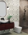
UNWIND IN SOPHISTICATION
In the unending chaos of our fast-paced world, the bathroom assumes its rightful place as a sanctuary for serenity.