
Karen and Kevin replaced the wooden worktops with quartz and gave the kitchen a spruce up.
Kitchen units spray painted in Pitch Black, Caperol. Dining table, Neptune, is also painted in Pitch Black. Dining chairs, Cox & Cox.
Pendant lights, Ardingly Antiques Market, with fittings and cord from Lamps & Lights
During the 26 years, they've lived here, Karen and Kevin have seen significant changes to their two-bedroom maisonette. After buying the ground floor of the beautiful Victorian building in 1996, the couple set about creating a home for the two of them until their son, Monty, came along. In need of more space – they'd sacrificed a second bedroom to create a larger kitchen – they bought the basement, then a communal area for the five apartments in the building, from their neighbours. Restoring this part of the building to its former glory – the couple found the original, blocked-off entrance to the basement in their own apartment was the start of an ongoing journey to add charm and personality to their family home, from panelling their bedroom to restoring character to the living room with coving.
Speaking to Karen, it's clear that her merchandising background and foray into styling have played a huge part in how the home looks today. She's carefully crafted a beautiful and cohesive scheme across two floors, contrasting strong colour palettes with natural textures that soften each room. I'm sure this home will see many more transformations before Karen and Kevin are finished with it - but before then, I asked Karen to talk me through how she created such a stunning space.
Q Your home has been through numerous projects and transformations, so what motivates these many changes?
هذه القصة مأخوذة من طبعة May 2022 من Real Homes.
ابدأ النسخة التجريبية المجانية من Magzter GOLD لمدة 7 أيام للوصول إلى آلاف القصص المتميزة المنسقة وأكثر من 9,000 مجلة وصحيفة.
بالفعل مشترك ? تسجيل الدخول
هذه القصة مأخوذة من طبعة May 2022 من Real Homes.
ابدأ النسخة التجريبية المجانية من Magzter GOLD لمدة 7 أيام للوصول إلى آلاف القصص المتميزة المنسقة وأكثر من 9,000 مجلة وصحيفة.
بالفعل مشترك? تسجيل الدخول
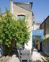
Side-return extensions
An efficient use of redundant outside space, extending to the side is the mart way to gain the extra room you crave and transform the way you live
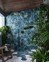
Spa-style bathrooms
Prioritise self-care and put pampering on your daily schedule by taking bathroom design inspo from your favourite spa
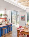
Light & bright
Rachel's main requirements for her kitchen extension were a window overlooking the garden and space to entertain. We reveal how she made her dream a reality
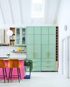
Colourful kitchens
Let your personality shine with a style that makes you smile from that morning cuppa to dinner time. Don't be shy, go for bold
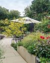
In the zone
Using clever design and planting, Pauline has transformed a blank canvas into an elegant, contemporary garden complete with social spaces, a cutting patch and a pond
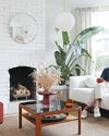
Heart of the home
Faced with three living spaces and a tiny kitchen, Jo and Chris have devised a clever, broken-plan layout where the kitchen takes centre stage
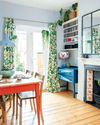
Pre-loved treasures
Deborah has filled her south London home with character without breaking the bank, thanks to her smart shopping know-how and eye for a bargain

A new leaf
Dani Sandels embraced her passion for botanics and natural textures in the renovation of her family home, resulting in a space that delights the eye at every turn
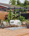
A learning experience
Steph and James honed their home-improvement skills as they updated their old house and overgrown garden with help from family and friends -
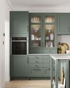
SAGE GREEN
A calm, tranquil and fresh hue, our colour guru, Amelia, shares why you can't go far wrong with this nearly neutral