يحاول ذهب - حر
Back to Basics with Black and White
Station Points
|International Artist
James Gurney shares basic painting exercises and applies them to field demonstrations in black and white gouache
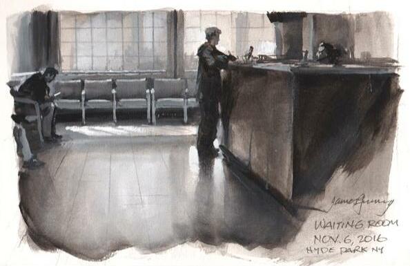
Whether you're a newbie to painting or a seasoned pro, experimenting with basic principles can stimulate your thinking and focus your field approach. In this article, the first in a series, let's explore what we can accomplish with black and white. We'll discover how a patch of gray looks different when it's made of transparent black compared to an opaquely mixed gray. We'll see what insights we can glean from other simple studio exercises, and apply them to real-world situations.

REDUCE THE VARIABLES
When you visit an art supply store, you are confronted with a bewildering array of colors to choose from. If you're just learning to paint, or if you're trying out an unfamiliar painting medium, it helps to reduce the variables. That way you can concentrate on just one of the three dimensions of color, namely value, and you can deal with hue and chroma later. Let's start with the smallest combination of pigments possible: ivory black and titanium white.
Pure black and white is a completely valid choice on its own terms for creative expression, especially when you want a stark, moody feeling. And it has practical benefits. If you're trying out a new kind of paint, such as gouache or casein, you don't have to invest in the full color set. When you go on location, you only need to bring two tubes of paint, and they're ideally suited to painting in limited light environments.

EXERCISE 1: COMPARE TRANSPARENT AND OPAQUE
هذه القصة من طبعة Station Points من International Artist.
اشترك في Magzter GOLD للوصول إلى آلاف القصص المتميزة المنسقة، وأكثر من 9000 مجلة وصحيفة.
هل أنت مشترك بالفعل؟ تسجيل الدخول
المزيد من القصص من International Artist
International Artist
Marshland Glow
Through glazing and scumbling, oil painter Karen Murphy manipulates her medium to create atmospheric landscapes
1 mins
August/September 2025
International Artist
Quiet Rhythm
Using deep shadows and a desaturated palette, Daria Antonova creates townscapes imbued with emotion
1 mins
August/September 2025
International Artist
To the Point
Keita Tsuji uses pointillism to heighten the color expression in his pastel paintings
1 mins
August/September 2025
International Artist
Change Up
Primarily a watercolor artist, Heidi Willis breaks down her approach to working with a new medium
2 mins
August/September 2025
International Artist
Form and Space
Alicia Ponzio's interest in human anatomy guides her sculptural works
2 mins
August/September 2025

International Artist
The Texture of Time
Bennett Prize winner Amy Werntz create works of art that celebrate the beauty that only comes with age
5 mins
August/September 2025
International Artist
Pattern making
My painting process is predominantly intuitive.
1 min
August/September 2025
International Artist
The Big Picture
Tony Thielen paints bold, expressive scenes by starting with the biggest shapes, then working toward the finer details
1 mins
August/September 2025
International Artist
Fluid Fusion
Pigments merge and create subtle gradients in Ian de Hoog's traditional wet-in-wet approach
2 mins
August/September 2025
International Artist
MAKING MOVES
How to pitch your work to the press
4 mins
August/September 2025
Translate
Change font size
