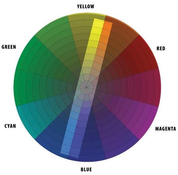
WHAT ARE COMPLEMENTARY COLORS?
Two colors are called complementary when they have opposite or balanced color characteristics, such as blue vs. yellow-orange or green vs. red-violet. Complementary hues appear across from each other on the color wheel. When you mix two such pigments together, they make gray or black. Mixing two complementary sources of light yields white light. When you stare at one hue for an extended period of time, the afterimage that emerges is the complementary color. These oppositional pairs are related by their antagonism. One balances the other, like riders on a seesaw. They cancel each other out, but they also amplify each other when used together in a picture.
Let’s examine complementary relationships by doing some paintings composed entirely of the two colors in the complementary pair, and leaving out the rest of the hues. So in the color wheel here, we’ll only use the blue/orange colors inside the central rectangle, and we won’t have access to the greens and magentas. We’ll start by doing some experiments in the studio and then applying what we learn in a few demonstrations.
EXERCISE 1: TRAN-OPAQUE COMPLEMENTARY BLEND
هذه القصة مأخوذة من طبعة Station Points من International Artist.
ابدأ النسخة التجريبية المجانية من Magzter GOLD لمدة 7 أيام للوصول إلى آلاف القصص المتميزة المنسقة وأكثر من 9,000 مجلة وصحيفة.
بالفعل مشترك ? تسجيل الدخول
هذه القصة مأخوذة من طبعة Station Points من International Artist.
ابدأ النسخة التجريبية المجانية من Magzter GOLD لمدة 7 أيام للوصول إلى آلاف القصص المتميزة المنسقة وأكثر من 9,000 مجلة وصحيفة.
بالفعل مشترك? تسجيل الدخول

Fresh Eyes
Anna Rose Bain discusses the passions of being an artist and helping students transform their own work
The Next Level
Jacob Dhein uses a wet-into-wet technique to create painterly depictions of a variety of subjects

Wild Spirit
Alternating between broad glazes and fine details, Claire Milligan captures the intricacies of the animal kingdom
The Bridge Between
Watercolorist Thomas Wells Schaller delves into the nuances of observation and imagination

The Color Continuum
Catherine Hearding demonstrates how she utilizes color to enhance the mood of her landscapes

Points of Precision
A strong focal point and attention to detail make Nicola Jane's artwork jump off the page

BE YOURSELF
Harley Brown's fascinating things no one else will tell you

JEFFREY T. LARSON
Expertly Putting the Pieces Together

Hot-Blooded
Blending elements of realism and surrealism, figurative artist Anna Wypych’'s paintings are dominated by vivid reds

Adam Clague Incandescence
Adam Clague’s masterful understanding of contrast allows him to paint subjects that seem to glow from within