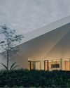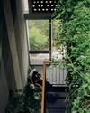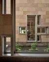
The aerial view of Muku Nursery looks like a collection of soap bubbles slowly rising up in the air, or an arrangement of various-sized sunshades on the beach.
On the ground, the view is a little different, however, when you notice that each “bubble” is actually a circular “room” – an umbrella-covered round space with no walls inside.
This was the vision that architect Takaharu Tezuka had for the school, which is located near the base of Mount Fuji in Japan.
THE IDEA BEHIND THE UNUSUAL DESIGN
“When I started working on the layout for Muku Nursery, I had the image of rice bowls in my mind,” says Tezuka, who, along with his wife Yui Tezuka, founded and runs Tezuka Architects in Tokyo.
“The client also runs a lunchbox company, so the rice-bowl concept made perfect sense to me. Besides, rice is an important part of Japanese cuisine; it’s a source of comfort and nourishment – something that I believe every nursery school should be.
“So I designed each circle to resemble a rice bowl, and if you look at the layout from above, even the umbrella-like tops look like the lids of the bowls that donburi (a Japanese rice-based dish) is typically served in.”
The nursery design is made up of 12 separate structures, bubbles or “rice bowls”, each one dedicated to a specific function such as classrooms and administrative offices.
Combined, they provide a total area of 403.51m 2.
According to Tezuka, many architects view circular plans to be disadvantageous compared to conventional modular planning.
For one, round rooms can be difficult to furnish. Second, it can be tricky placing supportive columns in a circular building.
Diese Geschichte stammt aus der Issue 112-Ausgabe von d+a.
Starten Sie Ihre 7-tägige kostenlose Testversion von Magzter GOLD, um auf Tausende kuratierte Premium-Storys sowie über 8.000 Zeitschriften und Zeitungen zuzugreifen.
Bereits Abonnent ? Anmelden
Diese Geschichte stammt aus der Issue 112-Ausgabe von d+a.
Starten Sie Ihre 7-tägige kostenlose Testversion von Magzter GOLD, um auf Tausende kuratierte Premium-Storys sowie über 8.000 Zeitschriften und Zeitungen zuzugreifen.
Bereits Abonnent? Anmelden

Tailored For The Curious Explorer
The new Alma House at the New Bahru enclave reflects the collaborative spirit of a school environment.

Eco And Egalitarian
Can a building represent a culture? Berrel Kräutler Architekten's sensitive renovation of the Embassy of Switzerland in Singapore stimulates discourse.

Building A Green Home
This semi-detached house by Zivy Architects explores passive tropical design, the delight in architecture and the issues of multi-generational living.

The Natural Balance
Inspired by the serene beauty of dewdrops, the Antao Collection by Villeroy & Boch transforms bathrooms into wellness sanctuaries, combining sustainability with timeless elegance.

Inspiring Creativity And Exploration
The new Hafary House at Lavender reflects the brand’s vibrancy and innovation, as well as provide an inspiring and engaging space for customers.

Home Is Where The Heart Is
A vacation house is reimagined for a multi-generational family to gather for holidays in the bucolic setting of Yongjia in Zhejiang, China.

balancing act: nature and humanity
In this inspiration-led series, we asked Jay Liu and Alex Liu, co-founders of Right Angle Studio, to dream up a unique interior concept using mainly items from Space Furniture.

rethinking, remaking, reframing
Aoki Akio, the founder of DESIGNART TOKYO discusses the importance and legacy of Tokyo's eminent art and design event, particularly for young creatives.

rebuilding communities
Shift2024, the much-anticipated conference returns with a stellar line-up of prolific architects making their mark in Asian urban design.

unparalleled italian craftsmanship
Filippo Arnaboldi, Chief Executive Officer of Frette, tells us how this luxury lifestyle Italian brand is moving forward with times yet not forgetting about its existing legacy.