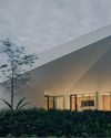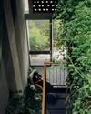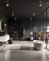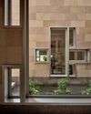
It is hard to miss Oh Yeah Brewing. Its name is displayed in a large font on the huge stainless-steel box positioned at the entrance and on the building’s beige, textured-finish facade.
Designed by hcreates, an interior design and consulting studio based in Shanghai, the new craft beer bar stands out from the concrete grey of its surroundings.
A GRAND ENTRANCE
Tucked behind rows of skyscrapers, the building was formerly the site of an aviation parts factory with a notable 10m-high ceiling.
“The client was opening an impressive venue that would instantly become a go-to in Beijing,” says Hannah Churchill, founder of hcreates.
“It was also the flagship space for a new international beer brand that needed to stand up globally. Given the scale of the space, we knew we had to be bold with the design.
“We felt right from the beginning that we wanted to have a dramatic reveal when people walked down the driveway. From there on, everything about the brewery was about creating a sense of an oasis in the middle of Beijing.”
Interestingly, Churchill revealed that they initially wanted a different approach to highlight the entrance but the landlord insisted they needed to retain the existing box structure.
In addition, she also needed to orientate the direction of the entrance as it was facing the doors of the building across the driveway, which was considered bad feng shui.
Working around the existing box structure, they decided to give it a fresh new look and shifted the entrance to the side than front on.
“Necessity, while adding challenges to the design process, can often give you the opportunity to balance the practical with design-centric response. In this instance, a double door entrance is a good barrier to help keep heat in the space in Beijing’s cold months.
Diese Geschichte stammt aus der Issue 114-Ausgabe von d+a.
Starten Sie Ihre 7-tägige kostenlose Testversion von Magzter GOLD, um auf Tausende kuratierte Premium-Storys sowie über 8.000 Zeitschriften und Zeitungen zuzugreifen.
Bereits Abonnent ? Anmelden
Diese Geschichte stammt aus der Issue 114-Ausgabe von d+a.
Starten Sie Ihre 7-tägige kostenlose Testversion von Magzter GOLD, um auf Tausende kuratierte Premium-Storys sowie über 8.000 Zeitschriften und Zeitungen zuzugreifen.
Bereits Abonnent? Anmelden

Tailored For The Curious Explorer
The new Alma House at the New Bahru enclave reflects the collaborative spirit of a school environment.

Eco And Egalitarian
Can a building represent a culture? Berrel Kräutler Architekten's sensitive renovation of the Embassy of Switzerland in Singapore stimulates discourse.

Building A Green Home
This semi-detached house by Zivy Architects explores passive tropical design, the delight in architecture and the issues of multi-generational living.

The Natural Balance
Inspired by the serene beauty of dewdrops, the Antao Collection by Villeroy & Boch transforms bathrooms into wellness sanctuaries, combining sustainability with timeless elegance.

Inspiring Creativity And Exploration
The new Hafary House at Lavender reflects the brand’s vibrancy and innovation, as well as provide an inspiring and engaging space for customers.

Home Is Where The Heart Is
A vacation house is reimagined for a multi-generational family to gather for holidays in the bucolic setting of Yongjia in Zhejiang, China.

balancing act: nature and humanity
In this inspiration-led series, we asked Jay Liu and Alex Liu, co-founders of Right Angle Studio, to dream up a unique interior concept using mainly items from Space Furniture.

rethinking, remaking, reframing
Aoki Akio, the founder of DESIGNART TOKYO discusses the importance and legacy of Tokyo's eminent art and design event, particularly for young creatives.

rebuilding communities
Shift2024, the much-anticipated conference returns with a stellar line-up of prolific architects making their mark in Asian urban design.

unparalleled italian craftsmanship
Filippo Arnaboldi, Chief Executive Officer of Frette, tells us how this luxury lifestyle Italian brand is moving forward with times yet not forgetting about its existing legacy.