A minor setback turns into a major gain for this landed home in sunny Singapore.

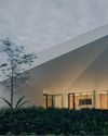
Suburban residential neighbourhoods often exude a sense of uniformity even if the houses are not all identical in appearance. Homes within a community will usually share some common traits such as roofing, colour schemes and similar layouts. This six-bedroom, three-storey home is an entirely unexpected sight amid the typical residential neighbourhood filled with conventional double-storey dwellings. Featuring plenty of sharp protruding pitched rooflines and monochromatic hues, the house definitely stands out with its unique shape amongst its peers but still manages to still blend in with the rest of the blocks thanks to its subtle palette.
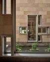
At first glance, the façade appears to adopt a minimalist look with its colour scheme but then the variation in height, angle and shades pique even a stranger’s interest. It draws you in for a second look although like most minimalist homes, it takes on a simple cubic configuration. Serving more than just for aesthetic purposes, each design element of the façade has a functional sensibility; the pitched roof planes tilt away from the western sun, sheltering the house from the blazing tropical heat while the multiple gaps between the walls and roof planes provide light and ventilation for the house.
Diese Geschichte stammt aus der Issue 97-Ausgabe von d+a.
Starten Sie Ihre 7-tägige kostenlose Testversion von Magzter GOLD, um auf Tausende kuratierte Premium-Storys sowie über 8.000 Zeitschriften und Zeitungen zuzugreifen.
Bereits Abonnent ? Anmelden
Diese Geschichte stammt aus der Issue 97-Ausgabe von d+a.
Starten Sie Ihre 7-tägige kostenlose Testversion von Magzter GOLD, um auf Tausende kuratierte Premium-Storys sowie über 8.000 Zeitschriften und Zeitungen zuzugreifen.
Bereits Abonnent? Anmelden

Tailored For The Curious Explorer
The new Alma House at the New Bahru enclave reflects the collaborative spirit of a school environment.

Eco And Egalitarian
Can a building represent a culture? Berrel Kräutler Architekten's sensitive renovation of the Embassy of Switzerland in Singapore stimulates discourse.

Building A Green Home
This semi-detached house by Zivy Architects explores passive tropical design, the delight in architecture and the issues of multi-generational living.

The Natural Balance
Inspired by the serene beauty of dewdrops, the Antao Collection by Villeroy & Boch transforms bathrooms into wellness sanctuaries, combining sustainability with timeless elegance.

Inspiring Creativity And Exploration
The new Hafary House at Lavender reflects the brand’s vibrancy and innovation, as well as provide an inspiring and engaging space for customers.

Home Is Where The Heart Is
A vacation house is reimagined for a multi-generational family to gather for holidays in the bucolic setting of Yongjia in Zhejiang, China.

balancing act: nature and humanity
In this inspiration-led series, we asked Jay Liu and Alex Liu, co-founders of Right Angle Studio, to dream up a unique interior concept using mainly items from Space Furniture.

rethinking, remaking, reframing
Aoki Akio, the founder of DESIGNART TOKYO discusses the importance and legacy of Tokyo's eminent art and design event, particularly for young creatives.

rebuilding communities
Shift2024, the much-anticipated conference returns with a stellar line-up of prolific architects making their mark in Asian urban design.

unparalleled italian craftsmanship
Filippo Arnaboldi, Chief Executive Officer of Frette, tells us how this luxury lifestyle Italian brand is moving forward with times yet not forgetting about its existing legacy.