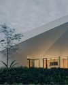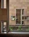
The mid-century modern aesthetic has been extremely popular in the last few years and now, a restaurant has opened where this style takes centrestage. California Republic harks back to the 1960s with its retro-cool vibe, while also embodying the easy, laid back spirit of the US’ Golden State.
Set in a heritage shophouse along Amoy Street in Singapore, it is the latest concept from The Dandy Collection, which took a lead role in its interiors, in collaboration with EDG Design.
The restaurant, with its Italian-inspired cuisine, also has personal significance to Michael Goodman, CoFounder and Chief Visionary Officer of The Dandy Collection. California was where he developed his relationship with food and established his career, after he moved over from New York, where he grew up.
With a floor plan that is long and slim like a Hollywood supermodel, Goodman had it split into four dining areas, with a fifth for the kitchen and bar. We caught up with him to find out how he designed California Republic to resemble a suburban living room complete with cosy nooks and countless tchotchkes.
How did you decide on the layout of the restaurant?
We took over an existing restaurant that was nearly brand new and, despite being a QSR (quick service restaurant), was built to a top spec. We wanted to use as much of the existing build as possible, especially the M&E and infrastructure. The old service counter became our bar and kitchen pass, and that really dictated a lot of the layout.
Diese Geschichte stammt aus der Issue 124-Ausgabe von d+a.
Starten Sie Ihre 7-tägige kostenlose Testversion von Magzter GOLD, um auf Tausende kuratierte Premium-Storys sowie über 8.000 Zeitschriften und Zeitungen zuzugreifen.
Bereits Abonnent ? Anmelden
Diese Geschichte stammt aus der Issue 124-Ausgabe von d+a.
Starten Sie Ihre 7-tägige kostenlose Testversion von Magzter GOLD, um auf Tausende kuratierte Premium-Storys sowie über 8.000 Zeitschriften und Zeitungen zuzugreifen.
Bereits Abonnent? Anmelden

Tailored For The Curious Explorer
The new Alma House at the New Bahru enclave reflects the collaborative spirit of a school environment.

Eco And Egalitarian
Can a building represent a culture? Berrel Kräutler Architekten's sensitive renovation of the Embassy of Switzerland in Singapore stimulates discourse.

Building A Green Home
This semi-detached house by Zivy Architects explores passive tropical design, the delight in architecture and the issues of multi-generational living.

The Natural Balance
Inspired by the serene beauty of dewdrops, the Antao Collection by Villeroy & Boch transforms bathrooms into wellness sanctuaries, combining sustainability with timeless elegance.

Inspiring Creativity And Exploration
The new Hafary House at Lavender reflects the brand’s vibrancy and innovation, as well as provide an inspiring and engaging space for customers.

Home Is Where The Heart Is
A vacation house is reimagined for a multi-generational family to gather for holidays in the bucolic setting of Yongjia in Zhejiang, China.

balancing act: nature and humanity
In this inspiration-led series, we asked Jay Liu and Alex Liu, co-founders of Right Angle Studio, to dream up a unique interior concept using mainly items from Space Furniture.

rethinking, remaking, reframing
Aoki Akio, the founder of DESIGNART TOKYO discusses the importance and legacy of Tokyo's eminent art and design event, particularly for young creatives.

rebuilding communities
Shift2024, the much-anticipated conference returns with a stellar line-up of prolific architects making their mark in Asian urban design.

unparalleled italian craftsmanship
Filippo Arnaboldi, Chief Executive Officer of Frette, tells us how this luxury lifestyle Italian brand is moving forward with times yet not forgetting about its existing legacy.