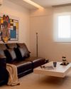
Meiyi was pretty much the perfect client. As a second-time homeowner, she knew exactly what she wanted even before viewing the property for the first time. Yet, she remained receptive to surprises her designer, Kaylin, might introduce. And did we mention she’s a former interior designer herself?
“Her brief was quick and easy to nail down, and we only had to work through the technical aspects of the project. She is also open to experimentation rather than falling back on what she is comfortable and familiar with,” said Kaylin.
This is obvious once you enter the apartment, distinguished by a cartoon-esque quality with its matte subway tiles and warm hues. Consider this your first clue that two lively children, aged four and seven, live here.
“Honestly, I held my breath about having so many colours in the same space. This was indeed an experiment, so I’m very relieved that it turned out okay,” said Meiyi.
To maintain harmony, Meiyi strategically placed colours throughout the apartment. She juxtaposed feature walls with neutral areas to ensure smooth transitions between spaces.
Small space, big impact
But there was another challenge: storage. Creating a family home for two energetic kiddos and their inevitable mess is a tall order, especially since the small apartment lacked a storeroom. Plus, Meiyi wasn't a big fan of built-in furniture.
The solution? Suspending storage cabinets above eye level to maximise floor space. To blend them seamlessly, they used a laminate matching the wall paint and aligned their height with structural beams.
"The design and position proved to be effective. We had to point the cabinets out to our guests when they asked where we hid our stuff," Meiyi quipped.
Diese Geschichte stammt aus der April 2024-Ausgabe von SquareRooms.
Starten Sie Ihre 7-tägige kostenlose Testversion von Magzter GOLD, um auf Tausende kuratierte Premium-Storys sowie über 8.000 Zeitschriften und Zeitungen zuzugreifen.
Bereits Abonnent ? Anmelden
Diese Geschichte stammt aus der April 2024-Ausgabe von SquareRooms.
Starten Sie Ihre 7-tägige kostenlose Testversion von Magzter GOLD, um auf Tausende kuratierte Premium-Storys sowie über 8.000 Zeitschriften und Zeitungen zuzugreifen.
Bereits Abonnent? Anmelden

Transform your laundry routine
Designed for the demands of modern urban living, Samsung’s Bespoke AI Laundry Combo redefines convenience by combining washing and drying in a single, space-saving unit.

Personal moments and timeless design
In a cosy flat filled with curated art and travel mementos, Amirul and Clarice's home tells a story of love, inspiration, and evolving tastes. From mid-century elements to modular classics, the couple shares how they shaped a space that reflects their journeys-and how it's still growing with them.

Old meets bold
Tim and Nicole were so enamoured with their Tiong Bahru rental that they bought it, preserving its midcentury charm while personalising the pre-war unit.

Branching out
With a tree at its centre and a mix of global influences across the ages, this home feels more like a living art gallery than a typical apartment.

Minimalist marvel
Thoughtfully designed by Ray Seah and Kate Sitchon, the space combines sleek aesthetics with practical solutions, offering the perfect balance of style and comfort.

Petite Paris
Channelling Parisian charm with a touch of Peranakan flair, this 4-room HDB flat looks like it belongs on the set of Emily in Paris.

Across the ages
In this one-of-a-kind home, the tastes of three generations— Baby Boomer, millennial, and Gen Z-converge.

Living artfully
Explore how Kave Home's Gala, Aiguablava, and Jondal collections bring together comfort, craftsmanship, and timeless style to transform any space into a haven of modern living.

A new chapter
Caesarstone adds 9 styles to its Porcelain Collection

The natural balance
Inspired by the serene beauty of dewdrops, the Antao Collection by Villeroy & Boch transforms bathrooms into wellness sanctuaries, combining sustainability with timeless elegance.