
Project: Go Native, Bangalore;
Architects: HUNDRED HANDS, Bangalore
This long structure bifurcates two heavy brick buildings which house the services and utilities (kitchen, storerooms, restrooms, staff areas, etc). The details and the overall structure are articulated to highlight this repeating theme of contrast.
In a detailed interview with A+D, the architects reveal and share thoughtful insights about their recently completed project 'Go Native', located in Bengaluru:
The very short but meaningful tagline of "Go Native' stores/cafes reads 'EAT + SHOP + CONNECT'. Did you relate to these three functions separately or as a whole while conceptualising the project? How was it articulated into the overall design?
We didn't really reflect on the tagline, but the project brief always asked for a place to unwind-generous, open, filled with light and air and flexible. We capitalised on the required setbacks and the linear character of the site, with the fortuitously placed existing trees, to create a sequence of enclosed, semi-enclosed and open spaces for passage and pause. This idea of putting together a composition of contrasting conditions is at the heart of the project. One is always encountering different conditions of enclosure, opacity, robustness, colour, stability and so on.
What were your very first thoughts about the site? What were your impressions about the existing trees/ plants? was it retained with specific purposes or was it a general conservation?
This story is from the {{IssueName}} edition of {{MagazineName}}.
Start your 7-day Magzter GOLD free trial to access thousands of curated premium stories, and 9,000+ magazines and newspapers.
Already a subscriber ? Sign In
This story is from the {{IssueName}} edition of {{MagazineName}}.
Start your 7-day Magzter GOLD free trial to access thousands of curated premium stories, and 9,000+ magazines and newspapers.
Already a subscriber? Sign In
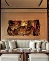
A RIVERSIDE SANCTUARY OF DESIGN AND ART
Perched along the Chao Phraya River, Capella Bangkok is an urban sanctuary crafted by Hamiltons International and BAMO, with art by Thai textile artist Ploenchan 'Mook' Vinyaratn-blending with Bangkok's cultural heartbeat to offer an experience that is both timeless and refined
THE SPORTING ICON
A manifesto of potential written in zinc, concrete, and imagination, this university sports arena showcases how thoughtful, innovative architecture can transform urban landscapes and foster a culture of excellence
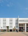
NATURE NURTURES LEARNING
Blending sustainability with innovative design, Morphogenesis' Vidyashilp Academy redefines educational spaces, fostering holistic development amidst Bengaluru's lush greenery
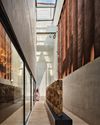
ME EPICENTER OF ART AND CULTURE
Arthshila at Okhla endeavours to epitomize the essence of exhibition spaces within the context of Delhi
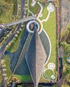
SAKA MUSEUM: BRIDGING SILENCE, HERITAGE, AND DESIGN
From the celestial glow of its lobby to the grounded textures of volcanic rock, the SAKA Museum is a masterclass in thoughtful, place-based design. Under the vision of Wesley Ho, co-founder of the Hong Kong-based firm Napp Studio & Architects, this design-forward museum has evolved into a living, breathing narrative of Bali's identity

SCHUECO INDIA INAUGURATES ITS INDIA WELCOME FORUM IN DELHI NCR
A celebration of innovation, sustainability, and luxury in architecture

PIONEERING DESIGN EDUCATION FORA BETTER WORLD
To commemorate the 10th Anniversary of The Design Village - India's first social design school, we talk to the leadership at the institute that carries its pioneering vision of education for social impact, winning the Don Norman Design Recognition for humanity-centered design, representing the Global South.

DIVIANA DEBUTS IN MILAN: A Landmark In Indian Luxury Design
In an extraordinary milestone for Indian luxury and design, DIVIANA, a premier Indian luxury furniture brand, has opened its first European flagship showroom in Milan's prestigious Montenapoleone District, at Via Monte di Pietà 13/1. This 3200 sq. ft. space seamlessly blends the rich heritage of Indian craftsmanship with the refined aesthetics of Italian design, establishing a bold new narrative for global luxury.

THE MASTER BUILDER
Architect Ayan Sen is committed to pushing the boundaries of design and innovation.

MASTERING THE ART OF DESIGN
In a candid chat with A+D, Nieves Contreras, Creative Director, Lladró speaks about her innate passion for design and her love for craftsmanship