
Prussian blue and black might seem too sombre for homes, but with the right balance of shine, they create magic in this apartment.
Homeowners Darren Sabom and Sharon Siah first approached architect William Ng from Studio Wills + Architects with a myriad of ideas for their duplex gathered from Pinterest. Their design ideas included the use of prints and patterns, subway and hexagonal tiles, coloured walls and wired glass.
Inspiration provided, they left the design up to William, who ensured all these elements were incorporated into the design of the kitchen, yard, and powder room on the first level, and common bathroom, master bedroom and bathroom on the second floor.
The clear distinction between the living and kitchen spaces is made by colouring the latter with the homeowners’ favourite colour – blue. Darren wanted an open-concept kitchen so the original walls between the kitchen and powder room were torn down; the powder room was then made smaller. “We love spending time at home and inviting friends over for dinner, so my favourite space is definitely the kitchen because it’s done with practical use in mind and is a nod to good design,” says Sharon.
The kitchen island sports a Caesarstone London Grey countertop – also used in the powder room – which cleanly contrasts with the rich blue of the cabinets. For highlights, William added Schoolhouse Electric brass light fittings above, as well gold cabinet handles.
This story is from the {{IssueName}} edition of {{MagazineName}}.
Start your 7-day Magzter GOLD free trial to access thousands of curated premium stories, and 9,000+ magazines and newspapers.
Already a subscriber ? Sign In
This story is from the {{IssueName}} edition of {{MagazineName}}.
Start your 7-day Magzter GOLD free trial to access thousands of curated premium stories, and 9,000+ magazines and newspapers.
Already a subscriber? Sign In

Building Spaces, Relationships, And Trust
Adrian Heng of Space One ID talks design evolution, his experiences in the industry, and the home that sparked his love for interior design.
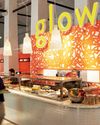
Glow By Supernature
A refreshing and immersive retail and dining experience for daily health and wellbeing needs.
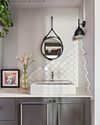
On-Trend Options To Consider
Small as it may be when compared to the rest of the home, the bathroom deserves pride of place because it is one place you can truly be on your own. So why not make it look spectacular with these touches.
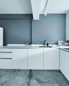
Cabinet Layout Ideas For An Open-Concept Kitchen
Breaking away from traditional enclosed cabinetry, these cabinet ideas offer a unique and refreshing approach that blends openness with functionality.

From Trash To Treasure
Designer Karyn Lim recounts her experience of creating the So Plast!c collection for the Designers & Crafters Edition 01 showcase co-curated by Industry+ and Sol Luminaire.
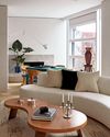
COOL VIBE IN MANHATTAN
Rising interior designer Matt McKay shares with KARINE MONIE how he drew inspiration from the 1960s and French design to create this apartment in Manhattan's West Village.
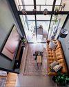
CITY LOFT
This bachelor pad feels like a Manhattan loft with its high ceiling, dark colour palette and a slight industrial edge.
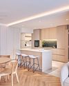
ROOMS FOR GROWTH
Smart lighting, minimalist material palette and clever spatial tweaks come together to create a cosy home with thoughtful considerations for the future. ASIH JENIE takes a tour.
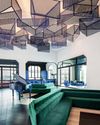
SAPPHIRE WINDOWS HEADQUARTERS AND SHOWROOM
The former factory warehouse is transformed into an elevated, grand and stunning showroom space, along with the Experiential Centre situated on Level Four.
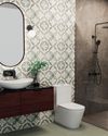
UNWIND IN SOPHISTICATION
In the unending chaos of our fast-paced world, the bathroom assumes its rightful place as a sanctuary for serenity.