
The owners, a retired couple in their 50s, bought this home so all three generations of the family could live under one roof. As the property was only five years old, it was still in fairly good condition, and they were prudent about what to retain and what to replace or change.
The external structure and some existing finishes, such as the living room floor and master bathroom tiles, have been preserved. Nonetheless, some changes were needed to make the home suitable for its new owners. So who better to take on this project than Collective Designs, which also designed their previous home?
On the to-do list were making the sloping vehicular access to the basement car porch easier to navigate, adding an outdoor gazebo, reconfiguring the back of the house to create a covered laundry and washing area, as well as making an interior entrance to the helper’s room, rather than an exterior one.
Despite being large, the existing living and dining rooms on the first floor felt rather cold. “We modified the ceiling height and added a full-height, floating bookshelf in front of the staircase. Besides creating a focal point within the expansive living and dining areas, it also disguises an existing column,” says principal designer Selina Tay.
Another major modification to the living area is a full-length feature wall with hidden doors leading to the guest room and powder room adjacent to the living area. The feature wall’s vertical fluting, curved elements and subtle gold trim showcase the design team’s attention to detail, brought to life by impeccable carpentry.
This story is from the {{IssueName}} edition of {{MagazineName}}.
Start your 7-day Magzter GOLD free trial to access thousands of curated premium stories, and 9,000+ magazines and newspapers.
Already a subscriber ? Sign In
This story is from the {{IssueName}} edition of {{MagazineName}}.
Start your 7-day Magzter GOLD free trial to access thousands of curated premium stories, and 9,000+ magazines and newspapers.
Already a subscriber? Sign In

Building Spaces, Relationships, And Trust
Adrian Heng of Space One ID talks design evolution, his experiences in the industry, and the home that sparked his love for interior design.

Glow By Supernature
A refreshing and immersive retail and dining experience for daily health and wellbeing needs.
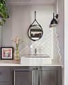
On-Trend Options To Consider
Small as it may be when compared to the rest of the home, the bathroom deserves pride of place because it is one place you can truly be on your own. So why not make it look spectacular with these touches.

Cabinet Layout Ideas For An Open-Concept Kitchen
Breaking away from traditional enclosed cabinetry, these cabinet ideas offer a unique and refreshing approach that blends openness with functionality.

From Trash To Treasure
Designer Karyn Lim recounts her experience of creating the So Plast!c collection for the Designers & Crafters Edition 01 showcase co-curated by Industry+ and Sol Luminaire.
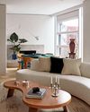
COOL VIBE IN MANHATTAN
Rising interior designer Matt McKay shares with KARINE MONIE how he drew inspiration from the 1960s and French design to create this apartment in Manhattan's West Village.
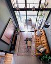
CITY LOFT
This bachelor pad feels like a Manhattan loft with its high ceiling, dark colour palette and a slight industrial edge.

ROOMS FOR GROWTH
Smart lighting, minimalist material palette and clever spatial tweaks come together to create a cosy home with thoughtful considerations for the future. ASIH JENIE takes a tour.

SAPPHIRE WINDOWS HEADQUARTERS AND SHOWROOM
The former factory warehouse is transformed into an elevated, grand and stunning showroom space, along with the Experiential Centre situated on Level Four.

UNWIND IN SOPHISTICATION
In the unending chaos of our fast-paced world, the bathroom assumes its rightful place as a sanctuary for serenity.