Vidhita Kharkar’s latest commercial project is a free-flowing space, with no visual hindrances whatsoever.

The moderately large, unused space in a 50-year-old building came with ample opportunities and challenges, both of which Kharkar has championed through her design. Occupied by members of a steel trading firm, the space was relatively large for its limited staff and three directors, giving the design team the option to experiment with light, materials, patterns and colours.
In its most raw form, the office was a bare shell with numerous columns introduced by the builder to strengthen the building. This helped demarcate rooms within the office and embody quirky design elements. “The office was part of the owner’s expansion plan, and needed to balance functionality with aesthetics. We decided to take the minimalistic route, so as to focus more on practicality and ease of use.”
An underlying theme that runs through every room is the use of straight lines and geometries. The colour scheme of black, white, grey and brown, is periodically broken by bursts of blue, which have now come to define the look.
This story is from the {{IssueName}} edition of {{MagazineName}}.
Start your 7-day Magzter GOLD free trial to access thousands of curated premium stories, and 9,000+ magazines and newspapers.
Already a subscriber ? Sign In
This story is from the {{IssueName}} edition of {{MagazineName}}.
Start your 7-day Magzter GOLD free trial to access thousands of curated premium stories, and 9,000+ magazines and newspapers.
Already a subscriber? Sign In
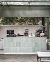
BALI IN BENGALURU
Studio Skapa Architects devises a sophisticated design for a cafe in Bengaluru that integrates with the surrounding nature
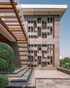
A ROBUST PRESENCE
Hiral Jobalia Studio helms the design of this 14,000sqft Firozabad residence that is accompanied by generous landscaped areas measuring nearly twice the size of the building footprint
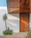
A SUBLIME STANCE
This spacious house in Gujarat, conceptualised by Dipen Gada & Associates, does away with frills and ostentation in favour of an aesthetic dictated by clean lines and tasteful restraint
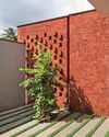
A CONTEXTUAL NARRATIVE
Natural elements effortlessly weave their way into this Ratnagiri house designed by Hrishikesh More Architects
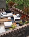
NATURE'S HUG
Thoughtfully designed by Manoj Patel Design Studio, this home in Gujarat integrates functionality with unique spatial experiences
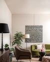
CLASSICALLY CONTEMPORARY
A confluence of neo-classical and modern elements form the crux of this fuss-free family home by TaP Design Inc.
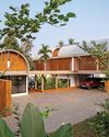
THE BLURRING REALMS
Conceived by LIJO.RENY.architects, the architecture of The Stoic Wall Residence-located in Kerala - shapes up in response to the region's tropical climate and the site's challenging physical conditions

A UNIQUE BLEND
Faisal Manzur facelifts this Chennai home with elements that seem simple but are crafted with utmost attention to detail

BRICK TALES
Charged Voids fosters an intimate brick-walled sanctuary for a multi-generational family in Chandigarh

The future is VERNACULAR!
Responsible and responsive, architects Pashmin Shah and Satyajeet Patwardhan are at the forefront of taking things slow and championing the modern vernacular design approach that is steeped in science, culture and so much more. In this exclusive, they discuss the larger picture with us