
Raise the roof
‘Using complementary tones within the same colour group creates an incredibly stylish and relaxing space, especially when using green or blue,’ says Charlotte Cosby, head of creative at Farrow & Ball. ‘In this instance, the darker shade has been used on the lower walls, the lighter on the ceiling and slightly onto the upper walls, which has opened up the ceiling view. If you need to create the impression of a lower ceiling, try this in reverse and use the darker shade on the ceiling and the lighter shade on the walls.’
GET THE LOOK Walls in Mere Green; ceiling in Arsenic; doors in Copenhagen Roof, all Farrow & Ball
Draw the line
The rule of thirds works perfectly in this hallway by interior designer Fiona Duke, who’s created a two-tone wall with a dividing line that picks up the border on the floor. ‘Incorporating doors into the paint line helps to draw attention away from them and create the illusion that the wall continues,’ says Fiona. Painting the lower wall in a dark colour is practical in a hallway; Fiona used a paint known for its scuff and stain resistance.
GET THE LOOK Walls in Apollo Blue Scuff-X and Super White, both Benjamin Moore
Colour confidence
This story is from the {{IssueName}} edition of {{MagazineName}}.
Start your 7-day Magzter GOLD free trial to access thousands of curated premium stories, and 9,000+ magazines and newspapers.
Already a subscriber ? Sign In
This story is from the {{IssueName}} edition of {{MagazineName}}.
Start your 7-day Magzter GOLD free trial to access thousands of curated premium stories, and 9,000+ magazines and newspapers.
Already a subscriber? Sign In
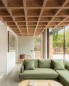
modern extensions
WITH STRIKING USE OF COLOUR, MATERIALS AND SHAPE, THE LATEST DESIGNS ADD SO MUCH MORE THAN AN EXTRA ROOM
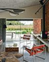
think like a pro
It's not just interior designers who are skilled at picking the perfect palette architects are in on the act, too, and Richard Parr knows just how to get the ideal shade
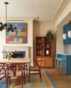
colour decoded
As with all successful schemes, there's much more going on beneath the surface of this space than first appears -Livingete's colour expert Amy Moorea Wong reveals all
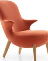
enduring style
B&B Italia has pioneered modern Italian furniture design since 1966 - but its latest collection feels as fresh as ever

TALES OF THE UNEXPECTED
Seventeenth-century origins meet vibrant contemporary design in a cleverly reimagined Amsterdam canal house

ROCK OF AGES
The owners of a Menorcan home have made a stylish yet sustainable retreat using the island's signature stone
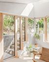
FORCE OF NATURE
An unexpected flood into what was already a dark basement flat prompted a new vision, full of light, natural materials and foliage
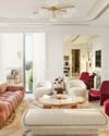
TOP OF THE WORLD
High above the busy streets of Bangkok, two talented designers have created a tranquil retreat that nods to chic 1970s style and makes the most of the views
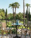
A PLACE IN THE SUN
An apartment within a former luxury hotel celebrates - and updates - the style of France's Côte d'Azur

OUTSIDE IN
The design of this modernist bungalow in South Africa was dictated by the trees on the plot and the desire for an indoor-outdoor flow