
All the trimmings
Sometimes, a small element of a design can set the tone for redecorating an entire space, and it's this trimmed voile that shoulders a lively re-imagining of this garden room by design studio Arent & Pyke. 'Pattern and repetition are balanced by block color in a feast of materiality,' say designers Juliette Arent and Sarah-Jane Pyke. 'The window treatment features a bespoke leading edge trim, giving weight and whimsy to the curtain.'
GET THE LOOK Bishop stool in Red by India Mahdavi
Top to toe
There's a buzz around the idea of 'color drenching' at the moment - that is, painting everything in a room the same, from ceiling to woodwork and walls. Whether you do this in a simple neutral or a bold hue, the effect is the same, making a room feel bigger by reducing visual clutter and adding a contemporary feel by breaking the shackles of the 'painted walls, white ceiling' decorating rut of the last few decades.
GET THE LOOK Walls, ceiling and woodwork in Old Ochre from Pure & Original
PHOTOGRAPHS (ALL THE TRIMMINGS) ANSON SMART STYLING STEVE CORDONY: (TOP TO TOE) MARGARET DE LANGE
A new classic
Where trending paint effects have previously come and gone by means of maximalist spaces (lest we forget the rag-rolling phenomenon of the early 2000s), limewash paints have been more widely adopted by minimalists - a way to add texture to walls and play with negative space more purposefully without a room feeling blank. They offer a richness and depth of colour that's beyond the means of a standard emulsion and, once you've got the hang of it, they're still relatively easy to apply.
This story is from the {{IssueName}} edition of {{MagazineName}}.
Start your 7-day Magzter GOLD free trial to access thousands of curated premium stories, and 9,000+ magazines and newspapers.
Already a subscriber ? Sign In
This story is from the {{IssueName}} edition of {{MagazineName}}.
Start your 7-day Magzter GOLD free trial to access thousands of curated premium stories, and 9,000+ magazines and newspapers.
Already a subscriber? Sign In
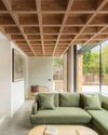
modern extensions
WITH STRIKING USE OF COLOUR, MATERIALS AND SHAPE, THE LATEST DESIGNS ADD SO MUCH MORE THAN AN EXTRA ROOM
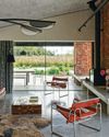
think like a pro
It's not just interior designers who are skilled at picking the perfect palette architects are in on the act, too, and Richard Parr knows just how to get the ideal shade
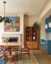
colour decoded
As with all successful schemes, there's much more going on beneath the surface of this space than first appears -Livingete's colour expert Amy Moorea Wong reveals all

enduring style
B&B Italia has pioneered modern Italian furniture design since 1966 - but its latest collection feels as fresh as ever

TALES OF THE UNEXPECTED
Seventeenth-century origins meet vibrant contemporary design in a cleverly reimagined Amsterdam canal house

ROCK OF AGES
The owners of a Menorcan home have made a stylish yet sustainable retreat using the island's signature stone
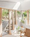
FORCE OF NATURE
An unexpected flood into what was already a dark basement flat prompted a new vision, full of light, natural materials and foliage

TOP OF THE WORLD
High above the busy streets of Bangkok, two talented designers have created a tranquil retreat that nods to chic 1970s style and makes the most of the views

A PLACE IN THE SUN
An apartment within a former luxury hotel celebrates - and updates - the style of France's Côte d'Azur

OUTSIDE IN
The design of this modernist bungalow in South Africa was dictated by the trees on the plot and the desire for an indoor-outdoor flow