We are all familiar with the phrase “God is in the details,” a term that’s very much applicable to interior design as it always comes down to the little things that transform the empty shell of a house into a home specifically curated for the occupants living within. This is perfectly demonstrated in this home’s makeover.
At the helm of the renovation project was local interior design firm Mesh Werk Studio, but as the property was new, there was minimal work required in terms of structural modifications. Additionally, the owners didn’t have a specific design theme in mind, so the team focused on maximising the functionality of the various spaces while creating an uncluttered yet cosy look.
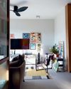
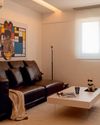
Right from the get-go, the chosen colour palette sets the home’s warm and restful ambience. In the living room, dark brown hues occupy the length of one wall, while white tones dress the other. Doing so ensures that no one colour is overpowering the other, effectively carving out a balanced and cohesive family room that feels welcoming and inviting.
Surrounding the television and Bang & Olufsen soundbar are dark wood vinyl panels arranged linearly in a 4m stretch. Besides functioning as a feature wall, this also hides storage units where the family’s precious collection of photo albums and other collectables reside. The design team shared that each vinyl strip was laid individually by hand, something that required a lot of time and hard work, but “the end result was definitely worth it.”
This story is from the {{IssueName}} edition of {{MagazineName}}.
Start your 7-day Magzter GOLD free trial to access thousands of curated premium stories, and 9,000+ magazines and newspapers.
Already a subscriber ? Sign In
This story is from the {{IssueName}} edition of {{MagazineName}}.
Start your 7-day Magzter GOLD free trial to access thousands of curated premium stories, and 9,000+ magazines and newspapers.
Already a subscriber? Sign In

Transform your laundry routine
Designed for the demands of modern urban living, Samsung’s Bespoke AI Laundry Combo redefines convenience by combining washing and drying in a single, space-saving unit.

Personal moments and timeless design
In a cosy flat filled with curated art and travel mementos, Amirul and Clarice's home tells a story of love, inspiration, and evolving tastes. From mid-century elements to modular classics, the couple shares how they shaped a space that reflects their journeys-and how it's still growing with them.

Old meets bold
Tim and Nicole were so enamoured with their Tiong Bahru rental that they bought it, preserving its midcentury charm while personalising the pre-war unit.

Branching out
With a tree at its centre and a mix of global influences across the ages, this home feels more like a living art gallery than a typical apartment.

Minimalist marvel
Thoughtfully designed by Ray Seah and Kate Sitchon, the space combines sleek aesthetics with practical solutions, offering the perfect balance of style and comfort.

Petite Paris
Channelling Parisian charm with a touch of Peranakan flair, this 4-room HDB flat looks like it belongs on the set of Emily in Paris.

Across the ages
In this one-of-a-kind home, the tastes of three generations— Baby Boomer, millennial, and Gen Z-converge.

Living artfully
Explore how Kave Home's Gala, Aiguablava, and Jondal collections bring together comfort, craftsmanship, and timeless style to transform any space into a haven of modern living.

A new chapter
Caesarstone adds 9 styles to its Porcelain Collection

The natural balance
Inspired by the serene beauty of dewdrops, the Antao Collection by Villeroy & Boch transforms bathrooms into wellness sanctuaries, combining sustainability with timeless elegance.