
“Less is more” appears to be the design mantra for this 5-room resale flat designed by Wayne Ching and Kate Ng from Design Neu. Fronting the renovation, Wayne says the married couple living here asked for a “modern setting” but wanted to personalise the look with “varying accent colours and geometrical details.” Since the modern style is usually simple and unadorned, the Design Neu team had to find a way to gel everything together without upsetting the design equilibrium.
Helming the overall conceptualisation of the space, Kate says they “envisioned the new modern setup to carry a clean and muted colour scheme.” That culminated in a pared-back palette of mostly warm monochromatic tones which borrow from nature-inspired elements. “We engaged a line-up of wood-like strips for the feature wall in the living area,” remarks Wayne.“ The wood colour of these laminate strips was carefully considered; we certainly didn’t want it too light or too dark. It had to be a classic wood shade.”
Setting the scene with a subdued wood-tone oozing of opulence, the laminate strips were then paired with a marble-effect laminate covering. “This marble-style accent wall is meant to break the wood composition,” explains Wayne. “Too much wood would look overpowering,” adds Kate, “and the marble serves as a good visual breather.” The grey veining of the marble style also echoes the neutral tone of the newly-installed tile flooring in the communal areas.
This story is from the {{IssueName}} edition of {{MagazineName}}.
Start your 7-day Magzter GOLD free trial to access thousands of curated premium stories, and 9,000+ magazines and newspapers.
Already a subscriber ? Sign In
This story is from the {{IssueName}} edition of {{MagazineName}}.
Start your 7-day Magzter GOLD free trial to access thousands of curated premium stories, and 9,000+ magazines and newspapers.
Already a subscriber? Sign In

Transform your laundry routine
Designed for the demands of modern urban living, Samsung’s Bespoke AI Laundry Combo redefines convenience by combining washing and drying in a single, space-saving unit.
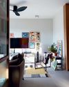
Personal moments and timeless design
In a cosy flat filled with curated art and travel mementos, Amirul and Clarice's home tells a story of love, inspiration, and evolving tastes. From mid-century elements to modular classics, the couple shares how they shaped a space that reflects their journeys-and how it's still growing with them.

Old meets bold
Tim and Nicole were so enamoured with their Tiong Bahru rental that they bought it, preserving its midcentury charm while personalising the pre-war unit.
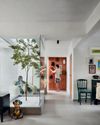
Branching out
With a tree at its centre and a mix of global influences across the ages, this home feels more like a living art gallery than a typical apartment.
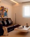
Minimalist marvel
Thoughtfully designed by Ray Seah and Kate Sitchon, the space combines sleek aesthetics with practical solutions, offering the perfect balance of style and comfort.

Petite Paris
Channelling Parisian charm with a touch of Peranakan flair, this 4-room HDB flat looks like it belongs on the set of Emily in Paris.

Across the ages
In this one-of-a-kind home, the tastes of three generations— Baby Boomer, millennial, and Gen Z-converge.
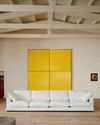
Living artfully
Explore how Kave Home's Gala, Aiguablava, and Jondal collections bring together comfort, craftsmanship, and timeless style to transform any space into a haven of modern living.

A new chapter
Caesarstone adds 9 styles to its Porcelain Collection

The natural balance
Inspired by the serene beauty of dewdrops, the Antao Collection by Villeroy & Boch transforms bathrooms into wellness sanctuaries, combining sustainability with timeless elegance.