
to step into Chiara Moro's fabulous two-storey apartment is to be transported into a technicolour world of rich, saturated tones. Unapologetically bold hues - whether a sensual plum or a playful yellow - create the sense of being immersed in a creative tour de force.
The apartment, inside a 1920s villa on Rome's Via Dandolo, is a stone's throw from the hip Trastevere neighbourhood. Its former inhabitants, two well-known faces on the city's cultural scene, had put up two floors for sale. Chiara, a marketing professional who had been searching for a property for some time meeting with endless disappointment in the process saw the listing and knew straight away from the pictures that she had to view it. 'I called to make an appointment and actually ran out of the office to go and see it,' she recalls. After the first visit, I immediately decided to buy it. As soon as I had crossed the threshold I felt like I'd been put under a spell. The house was so charming - you could breathe in its unique, ancient, romantic atmosphere. It exuded culture and the many stories that it had seen. The spaces were in good condition, but having been lived in for half a century, a renovation was a must.'
Chiara found an instant synergy with her chosen architect, Annalisa Mauri, and gave her free rein on the project, although they were in constant dialogue throughout the revamp. 'Chiara's partner is an artist, which meant she was open to a visual conversation between art, design and architecture; as well as a dialogue between past and present,' explains Annalisa. 'Her only request was to include colour, rather than leaving the spaces anonymous. The apartment already had its intrinsic personality, so it didn't need further elements to enhance it. We didn't want to overturn the spatial identity, we simply wanted to complement it,' she says.
This story is from the {{IssueName}} edition of {{MagazineName}}.
Start your 7-day Magzter GOLD free trial to access thousands of curated premium stories, and 9,000+ magazines and newspapers.
Already a subscriber ? Sign In
This story is from the {{IssueName}} edition of {{MagazineName}}.
Start your 7-day Magzter GOLD free trial to access thousands of curated premium stories, and 9,000+ magazines and newspapers.
Already a subscriber? Sign In
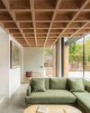
modern extensions
WITH STRIKING USE OF COLOUR, MATERIALS AND SHAPE, THE LATEST DESIGNS ADD SO MUCH MORE THAN AN EXTRA ROOM
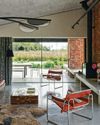
think like a pro
It's not just interior designers who are skilled at picking the perfect palette architects are in on the act, too, and Richard Parr knows just how to get the ideal shade
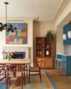
colour decoded
As with all successful schemes, there's much more going on beneath the surface of this space than first appears -Livingete's colour expert Amy Moorea Wong reveals all
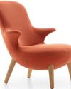
enduring style
B&B Italia has pioneered modern Italian furniture design since 1966 - but its latest collection feels as fresh as ever

TALES OF THE UNEXPECTED
Seventeenth-century origins meet vibrant contemporary design in a cleverly reimagined Amsterdam canal house
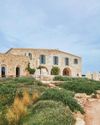
ROCK OF AGES
The owners of a Menorcan home have made a stylish yet sustainable retreat using the island's signature stone
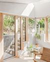
FORCE OF NATURE
An unexpected flood into what was already a dark basement flat prompted a new vision, full of light, natural materials and foliage

TOP OF THE WORLD
High above the busy streets of Bangkok, two talented designers have created a tranquil retreat that nods to chic 1970s style and makes the most of the views
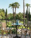
A PLACE IN THE SUN
An apartment within a former luxury hotel celebrates - and updates - the style of France's Côte d'Azur

OUTSIDE IN
The design of this modernist bungalow in South Africa was dictated by the trees on the plot and the desire for an indoor-outdoor flow