
Open-plan living has gone hand-in-hand with a growing obsession with wellness, for good reason. It has the effect of making all spaces feel bigger and brighter. Open concept offers a more cheerful outlook than smaller, darker rooms, whether in the glow of summer or the gloom of winter. But, while we've been (largely) convinced on the open concept's advantage for the heart of our home - our kitchens, living spaces and dining rooms - it's an idea that's been less adopted in other spaces, such as the bedroom. Could that space not benefit from this same uplifting quality, too?
Maybe the more appropriate question is, what's the right project to take a space like a bedroom and make it open plan? 'It's really about what you're going for, New York-based interior designer Crystal Sinclair tells us. 'Keeping a space more open can make it feel more grand, whereas a closed space feels more homely. Surely, for a space like a bedroom, you want more of that cosy, comforting feel?
'But it's not that an open space can't feel cosy, Crystal continues. Take, for example, her studio's design of a loft in the trendy Dumbo neighbourhood in Brooklyn (right). More 'broken plan' than open plan, Crystal retained the sense of grandeur of the high ceilings and ensured the entire space benefited from as much natural light as possible by using a steel-framed glazed divider between the living room and bedroom over a solid partition wall.
While, in fairness, it's a one-bedroom apartment and so privacy may not be such a huge concern for the owners, the bedroom can still become its own distinct haven, thanks to curtain lining the length of the divider. Not only does it make the bedroom completely private, helping this apartment benefit from the best of both worlds, it also brings a softness that's the perfect backdrop for a cosy bedroom.
This story is from the {{IssueName}} edition of {{MagazineName}}.
Start your 7-day Magzter GOLD free trial to access thousands of curated premium stories, and 9,000+ magazines and newspapers.
Already a subscriber ? Sign In
This story is from the {{IssueName}} edition of {{MagazineName}}.
Start your 7-day Magzter GOLD free trial to access thousands of curated premium stories, and 9,000+ magazines and newspapers.
Already a subscriber? Sign In
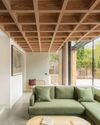
modern extensions
WITH STRIKING USE OF COLOUR, MATERIALS AND SHAPE, THE LATEST DESIGNS ADD SO MUCH MORE THAN AN EXTRA ROOM
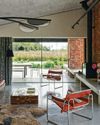
think like a pro
It's not just interior designers who are skilled at picking the perfect palette architects are in on the act, too, and Richard Parr knows just how to get the ideal shade
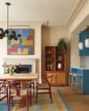
colour decoded
As with all successful schemes, there's much more going on beneath the surface of this space than first appears -Livingete's colour expert Amy Moorea Wong reveals all

enduring style
B&B Italia has pioneered modern Italian furniture design since 1966 - but its latest collection feels as fresh as ever

TALES OF THE UNEXPECTED
Seventeenth-century origins meet vibrant contemporary design in a cleverly reimagined Amsterdam canal house

ROCK OF AGES
The owners of a Menorcan home have made a stylish yet sustainable retreat using the island's signature stone
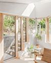
FORCE OF NATURE
An unexpected flood into what was already a dark basement flat prompted a new vision, full of light, natural materials and foliage
TOP OF THE WORLD
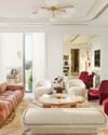
High above the busy streets of Bangkok, two talented designers have created a tranquil retreat that nods to chic 1970s style and makes the most of the views

A PLACE IN THE SUN
An apartment within a former luxury hotel celebrates - and updates - the style of France's Côte d'Azur

OUTSIDE IN
The design of this modernist bungalow in South Africa was dictated by the trees on the plot and the desire for an indoor-outdoor flow