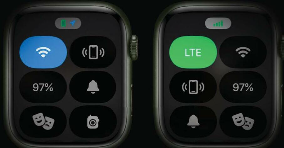
ONE OF THE most useful things on your Apple Watch may be hiding in plain sight. That's because Apple moved the Control Center when it launched watchOS 10, so it's easy to forget it's there: the upwards swipe that used to open Control Center now brings up your widgets instead, and Control Center now requires you to press the side button.
FAST ACCESS
While the Control Center has been relocated from watch face to watch button, it's still very useful, and while of course it's a lot simpler than Control Center on your iPhone or iPad it does the same job; it gives you fast access to commonly used features and settings. It can also help you find your iPhone if you've misplaced it. In this tutorial, we'll discover how to use Control Center, how to add more controls to it and how to reorganize it to suit your personal preference. We'll also discover how you can remove most of the icons if you don't need them. We say "most" because Apple has decided that some icons need to remain in ft Control Center whether you want them or not. You can't delete them, but you can move them so they're tucked away out of sight. We'll also discover one of the best things about Control Center: the extra features you can access by long-pressing the icons.
In these pages, we'll be looking at the Control Center in watchOS 10 but versions 8 onwards are very similar.
HOW TO Organize Control Center on Apple Watch
1 Open it up
This story is from the {{IssueName}} edition of {{MagazineName}}.
Start your 7-day Magzter GOLD free trial to access thousands of curated premium stories, and 9,000+ magazines and newspapers.
Already a subscriber ? Sign In
This story is from the {{IssueName}} edition of {{MagazineName}}.
Start your 7-day Magzter GOLD free trial to access thousands of curated premium stories, and 9,000+ magazines and newspapers.
Already a subscriber? Sign In

THE ULTIMATE APPLE FITNESS GUIDE
Discover some great ways you can use your iPhone and Apple Watch to get fitter and healthier in 2025

Use spatial capture on iPhone
Capture stills and clips that can be viewed in 3D on the Apple Vision Pro

Manage your music
In the final part of our guide, we explain how Apple Music can help manage your song collection

DETOX YOUR MAC (and iOS devices)
Are you running out of storage? Do you wish your Mac was quick and snappy again? With our help, you can get rid of space hogs, delete temporary files, and more

Use Writing Tools
Write smarter in apps like Pages, Notes, Mail and Messages

Get funky with Messages in iOS
Add text effects and more to your chats

What's new in Mail
Handle your messages the smart way with new Apple Intelligence features

Name that tune!
Easily identify songs on Apple Watch we show you how

What's new in Siri on iPhone
Siri is definitely more stylish and it’s a lot smarter now too

Clean up your photos
Use the new Al-powered Clean Up tool to remove unwanted objects