
The language we use to describe colour affects our ability to represent it accurately. Take the robin redbreast [above] as an example. On many Christmas cards, the demonstrably orange-breasted bird is depicted with an eponymous red bib and most children would reach for a red felt-tip if they came across one in a colouring book.
This imaginative distortion of the robin’s colouring no doubt happened because the nickname “redbreast” was given to the bird prior to the word “orange” even entering the English language.
The word “orange” initially appeared in reference to the fruit, only later being used to describe a discreet hue from the 16th century onwards.
Lacking the linguistic category of orange, our predecessors were forced to use either red or yellow instead. In fact, when Geoffrey Chaucer tried to write about a fox in The Nun’s Priest’s Tale two centuries prior to that, he had to call it simply a colour “betwixe yellow and reed” [sic]. Such descriptions echo through our visual culture and lead to the miscolouring of small birds on seasonal greeting cards in the 21st century.
I give this example to show how we are prone to misrepresenting colours if we do not have the adequate vocabulary to describe them. It is only by first broadening and clarifying our written and spoken language that we can learn to visually represent the full spectrum more accurately. In this new four-part series, I’ll be looking at how we can use an understanding of the fundamental properties of colour to look at the world around us and create more compelling artwork.
LOOKING AT COLOUR
この記事は Artists & Illustrators の June 2021 版に掲載されています。
7 日間の Magzter GOLD 無料トライアルを開始して、何千もの厳選されたプレミアム ストーリー、9,000 以上の雑誌や新聞にアクセスしてください。
すでに購読者です ? サインイン
この記事は Artists & Illustrators の June 2021 版に掲載されています。
7 日間の Magzter GOLD 無料トライアルを開始して、何千もの厳選されたプレミアム ストーリー、9,000 以上の雑誌や新聞にアクセスしてください。
すでに購読者です? サインイン

Still life IN 3 HOURS
Former BP Portrait Award runner-up FELICIA FORTE guides you through a simple, structured approach to painting alla prima that tackles dark, average and light colours in turn
Movement in composition
Through an analysis of three masterworks, landscape painter and noted author MITCHELL ALBALA shows how you can animate landscape composition with movement
Shane Berkery
The Irish-Japanese artist talks to REBECCA BRADBURY about the innovative concepts and original colour combinations he brings to his figurative oil paintings from his Dublin garden studio

The Working Artist
Something old, something new... Our columnist LAURA BOSWELL has expert advice for balancing fresh ideas with completing half-finished work
Washes AND GLAZES
Art Academy’s ROB PEPPER introduces an in-depth guide to incorporating various techniques into your next masterpiece. Artwork by STAN MILLER, CHRIS ROBINSON and MICHELE ILLING
Hands
LAURA SMITH continues her new four-part series, which encourages you to draw elements of old master paintings, and this month’s focus is on capturing hands

Vincent van Gogh
To celebrate The Courtauld’s forthcoming landmark display of the troubled Dutch master’s self-portraits, STEVE PILL looks at the stories behind 10 of the most dramatic works on display
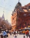
BRING THE drama
Join international watercolour maestro ALVARO CASTAGNET in London’s West End to paint a dramatic street scene
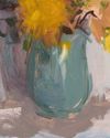
Serena Rowe
The Scottish painter tells STEVE PILL why time is precious, why emotional responses to colour are useful, and how she finds focus every day with the help of her studio wall

Bill Jacklin
Chatting over Zoom as he recovers from appendicitis, the Royal Academician tells STEVE PILL about classic scrapes in New York and his recent experiments with illustration