Artist Joe Dowden Answers Your Queries About Capturing Water in the Tricky Medium of Watercolour.

What are some clever ways for approaching light reflections on the water’s surface in watercolour paint?
The first thing is, I don’t paint light, I paint dark. In fact I’m all about dark. I’ve had two eureka moments – one at a roadside brook and the other in a purpose built basement studio – that enabled me to make the leap from painting water to letting it paint itself. The first time, I noticed the paint had settled evenly in a wet wash below a dark-clad bank, and I just left it. The trick is to put it on once and leave it alone. That didn’t work every time, but the second eureka moment solved it. This was during a painting of the Kennet and Avon canal, away from the scene using reference material.
Much indecision about colour resulted in many deep rich pools of different colours on several palettes. Putting masses of wet colours in different places into the same wet wash and letting them blend produced fantastic deep reflections.
What basic palette should I be working with when painting water?
For deep blue sky reflections in the foreground I use Phthalo Blue mixed with a black or Payne’s Grey or Neutral Tint, or mixed with a graduated dark of Quinacridone Magenta, moving up through Burnt Sienna and then into a cleaner blue, with intense dark in the foreground.
For the woodland river reflections I use Cadmium Lemon, Phthalo Green, Burnt Sienna and an intense dark of Payne’s Grey or Neutral Tint. I steer clear of mixed darks of Ultramarine Blue, as these lack power and work against strong values. I sometimes use a lot of Naples Yellow, and I don’t mind saying I had to break a lot of rules to develop this palette.
I developed these methods by painting water on site. You can get away with: Cadmium Lemon, Phthalo Green, Burnt Sienna, Quinacridone Magenta, Payne’s Grey, Cobalt Blue and Ultramarine Blue.
この記事は Artists & Illustrators の February 2017 版に掲載されています。
7 日間の Magzter GOLD 無料トライアルを開始して、何千もの厳選されたプレミアム ストーリー、9,000 以上の雑誌や新聞にアクセスしてください。
すでに購読者です ? サインイン
この記事は Artists & Illustrators の February 2017 版に掲載されています。
7 日間の Magzter GOLD 無料トライアルを開始して、何千もの厳選されたプレミアム ストーリー、9,000 以上の雑誌や新聞にアクセスしてください。
すでに購読者です? サインイン

Still life IN 3 HOURS
Former BP Portrait Award runner-up FELICIA FORTE guides you through a simple, structured approach to painting alla prima that tackles dark, average and light colours in turn
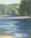
Movement in composition
Through an analysis of three masterworks, landscape painter and noted author MITCHELL ALBALA shows how you can animate landscape composition with movement

Shane Berkery
The Irish-Japanese artist talks to REBECCA BRADBURY about the innovative concepts and original colour combinations he brings to his figurative oil paintings from his Dublin garden studio
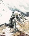
The Working Artist
Something old, something new... Our columnist LAURA BOSWELL has expert advice for balancing fresh ideas with completing half-finished work
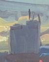
Washes AND GLAZES
Art Academy’s ROB PEPPER introduces an in-depth guide to incorporating various techniques into your next masterpiece. Artwork by STAN MILLER, CHRIS ROBINSON and MICHELE ILLING

Hands
LAURA SMITH continues her new four-part series, which encourages you to draw elements of old master paintings, and this month’s focus is on capturing hands

Vincent van Gogh
To celebrate The Courtauld’s forthcoming landmark display of the troubled Dutch master’s self-portraits, STEVE PILL looks at the stories behind 10 of the most dramatic works on display
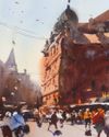
BRING THE drama
Join international watercolour maestro ALVARO CASTAGNET in London’s West End to paint a dramatic street scene
Serena Rowe
The Scottish painter tells STEVE PILL why time is precious, why emotional responses to colour are useful, and how she finds focus every day with the help of her studio wall

Bill Jacklin
Chatting over Zoom as he recovers from appendicitis, the Royal Academician tells STEVE PILL about classic scrapes in New York and his recent experiments with illustration