In the Chinese city’s second annual design week, sustainability reigned alongside exploring the values and possibilities of creativity. A spotlight was also shone on Italian designers in South China.

Returning for the second year in a row, Shenzhen Design Week took place in two key venues: Design Society and the Museum of Contemporary Art and Urban Planning Shenzhen. The programme paid homage to classic designs, celebrated innovative ideas, and spotlighted emerging designers.
Possibilities of Design was an umbrella theme that ran across all the exhibitions at Design Society, an art centre on the habour front of Shekou designed by Japanese architect Fumihiko Maki, and Coop Himmelblau’s Museum of Contemporary Art and Urban Planning in Futian District.
In recognition of the contributions made by Italian architects and designers living and working in South China, they were given their day in the sun. The Italian Pavilion named “From Micro to Macro” at Design Society showcased works of 13 Italian design practices based in the region, examining their ideas, concepts and products, from their inception to how they function within a larger ecosystem.
Divided into four pillars, the Italian designers’ portfolio was named “Unexpected”, “Responsive”, “Mindful” and “Interaction”. The colour red was chosen, as “it is present in both the China and Italian flag, and a different visual way to connect both countries”. “The design of the pavilion has been developed from the concept of caravanserai, inspired by the many convoys that travelled the ancient Silk Road connecting China and Italy,” shares Francesco Carota, architect and curator of the Italian Pavilion.
“Here, merchants and traders gathered around a square (or piazza if you will) to exchange, trade and share. The interaction of these travellers [have] creativity at the centre to share and exchange ideas.”
この記事は d+a の Issue 105 版に掲載されています。
7 日間の Magzter GOLD 無料トライアルを開始して、何千もの厳選されたプレミアム ストーリー、9,000 以上の雑誌や新聞にアクセスしてください。
すでに購読者です ? サインイン
この記事は d+a の Issue 105 版に掲載されています。
7 日間の Magzter GOLD 無料トライアルを開始して、何千もの厳選されたプレミアム ストーリー、9,000 以上の雑誌や新聞にアクセスしてください。
すでに購読者です? サインイン

Tailored For The Curious Explorer
The new Alma House at the New Bahru enclave reflects the collaborative spirit of a school environment.
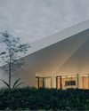
Eco And Egalitarian
Can a building represent a culture? Berrel Kräutler Architekten's sensitive renovation of the Embassy of Switzerland in Singapore stimulates discourse.
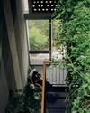
Building A Green Home
This semi-detached house by Zivy Architects explores passive tropical design, the delight in architecture and the issues of multi-generational living.
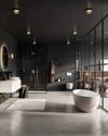
The Natural Balance
Inspired by the serene beauty of dewdrops, the Antao Collection by Villeroy & Boch transforms bathrooms into wellness sanctuaries, combining sustainability with timeless elegance.

Inspiring Creativity And Exploration
The new Hafary House at Lavender reflects the brand’s vibrancy and innovation, as well as provide an inspiring and engaging space for customers.
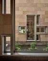
Home Is Where The Heart Is
A vacation house is reimagined for a multi-generational family to gather for holidays in the bucolic setting of Yongjia in Zhejiang, China.
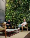
balancing act: nature and humanity
In this inspiration-led series, we asked Jay Liu and Alex Liu, co-founders of Right Angle Studio, to dream up a unique interior concept using mainly items from Space Furniture.

rethinking, remaking, reframing
Aoki Akio, the founder of DESIGNART TOKYO discusses the importance and legacy of Tokyo's eminent art and design event, particularly for young creatives.

rebuilding communities
Shift2024, the much-anticipated conference returns with a stellar line-up of prolific architects making their mark in Asian urban design.

unparalleled italian craftsmanship
Filippo Arnaboldi, Chief Executive Officer of Frette, tells us how this luxury lifestyle Italian brand is moving forward with times yet not forgetting about its existing legacy.