
WHO LIVES HERE
A family of five
HOME An inter-terrace house in Joo Chiat
SIZE 3,460 sq ft
When Ng Sier Han and his wife Jasmine Soh found this interterrace property in Joo Chiat, it was in its original 1970s condition – from the exterior right down to the light fittings, fans and grilles. The midcentury architecture appealed to the couple, who wanted to retain as much of the original style as possible.
“We feel that not enough properties are being conserved today. Our vision was to respect the surrounding rows of interterraces from the same period while updating the interior for modern living,” says Sier Han.
The couple, both in banking, engaged architecture firm Ong&Ong through a friend’s recommendation. Directors Diego Molina and Maria Arango helmed the design, while project designer Ryan Manuel oversaw the day-to-day running of the project.
Apart from conserving as many of the 1970s elements as possible and updating the house to meet the needs of three generations, including two boys aged four and three and Jasmine’s mother, the clients’ brief also asked for an open design. “This would allow us to supervise the children at play while we are working and for the kids to see us if we are entertaining friends,” Jasmine explains.
For this major Addition and Alteration (A&A) project, it was important for the massing of the new place to relate to the low-rise form and understated quality of the original house and its neighbours. This was achieved by setting back the third storey and roof terrace volume so that it appears to be two storeys from the street level.
この記事は Home & Decor Singapore の April 2021 版に掲載されています。
7 日間の Magzter GOLD 無料トライアルを開始して、何千もの厳選されたプレミアム ストーリー、9,000 以上の雑誌や新聞にアクセスしてください。
すでに購読者です ? サインイン
この記事は Home & Decor Singapore の April 2021 版に掲載されています。
7 日間の Magzter GOLD 無料トライアルを開始して、何千もの厳選されたプレミアム ストーリー、9,000 以上の雑誌や新聞にアクセスしてください。
すでに購読者です? サインイン

Building Spaces, Relationships, And Trust
Adrian Heng of Space One ID talks design evolution, his experiences in the industry, and the home that sparked his love for interior design.

Glow By Supernature
A refreshing and immersive retail and dining experience for daily health and wellbeing needs.
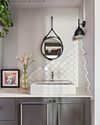
On-Trend Options To Consider
Small as it may be when compared to the rest of the home, the bathroom deserves pride of place because it is one place you can truly be on your own. So why not make it look spectacular with these touches.

Cabinet Layout Ideas For An Open-Concept Kitchen
Breaking away from traditional enclosed cabinetry, these cabinet ideas offer a unique and refreshing approach that blends openness with functionality.

From Trash To Treasure
Designer Karyn Lim recounts her experience of creating the So Plast!c collection for the Designers & Crafters Edition 01 showcase co-curated by Industry+ and Sol Luminaire.
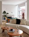
COOL VIBE IN MANHATTAN
Rising interior designer Matt McKay shares with KARINE MONIE how he drew inspiration from the 1960s and French design to create this apartment in Manhattan's West Village.
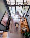
CITY LOFT
This bachelor pad feels like a Manhattan loft with its high ceiling, dark colour palette and a slight industrial edge.
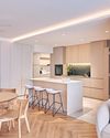
ROOMS FOR GROWTH
Smart lighting, minimalist material palette and clever spatial tweaks come together to create a cosy home with thoughtful considerations for the future. ASIH JENIE takes a tour.

SAPPHIRE WINDOWS HEADQUARTERS AND SHOWROOM
The former factory warehouse is transformed into an elevated, grand and stunning showroom space, along with the Experiential Centre situated on Level Four.
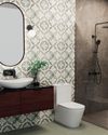
UNWIND IN SOPHISTICATION
In the unending chaos of our fast-paced world, the bathroom assumes its rightful place as a sanctuary for serenity.