
In December last year, Sydney, Australia, saw a new addition to its cultural offerings with the Sydney Modern Project. Designed by Pritzker Prize-winning Japanese firm SANAA helmed by Kazuyo Sejima and Ryue Nishizawa, the building reviews the museum trope with a spectacular design that makes a fine case study on the relationship between building and place.
“The new expansion is a series of pavilions placed on a terraced site. The experience of seeing art and the building is intertwined with the experience of understanding the site and the Sydney context,” says project architect Asano Yagi.
specific to site
The new built forms correspond with the 151-year-old Art Gallery of New South Wales that has an iconic 19th-century neoclassical façade. The fragmentation of the new build relates to the scale of the existing building and brings the landscape closer to the core. “They sit in the landscape plan with the neighbouring Domain – a 34-hectare parkland east of the Central Business District – and Royal Botanic Gardens. The [old and new components] work together and do not dominate one another,” says Yagi.
The architecture adds much-needed exhibition space to the existing offerings while respecting and enhancing the use of the surrounding landscape of the Domain. Significant trees were retained and the access to Sydney’s eastern cultural prescient was improved with the transformation of a land bridge built in the late 1990s to connect the Art Gallery to the Botanic Gardens into an art garden and civic gathering space.
この記事は d+a の Issue 128 版に掲載されています。
7 日間の Magzter GOLD 無料トライアルを開始して、何千もの厳選されたプレミアム ストーリー、9,000 以上の雑誌や新聞にアクセスしてください。
すでに購読者です ? サインイン
この記事は d+a の Issue 128 版に掲載されています。
7 日間の Magzter GOLD 無料トライアルを開始して、何千もの厳選されたプレミアム ストーリー、9,000 以上の雑誌や新聞にアクセスしてください。
すでに購読者です? サインイン

Tailored For The Curious Explorer
The new Alma House at the New Bahru enclave reflects the collaborative spirit of a school environment.
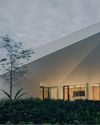
Eco And Egalitarian
Can a building represent a culture? Berrel Kräutler Architekten's sensitive renovation of the Embassy of Switzerland in Singapore stimulates discourse.
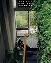
Building A Green Home
This semi-detached house by Zivy Architects explores passive tropical design, the delight in architecture and the issues of multi-generational living.
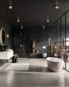
The Natural Balance
Inspired by the serene beauty of dewdrops, the Antao Collection by Villeroy & Boch transforms bathrooms into wellness sanctuaries, combining sustainability with timeless elegance.

Inspiring Creativity And Exploration
The new Hafary House at Lavender reflects the brand’s vibrancy and innovation, as well as provide an inspiring and engaging space for customers.
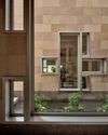
Home Is Where The Heart Is
A vacation house is reimagined for a multi-generational family to gather for holidays in the bucolic setting of Yongjia in Zhejiang, China.
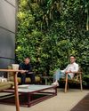
balancing act: nature and humanity
In this inspiration-led series, we asked Jay Liu and Alex Liu, co-founders of Right Angle Studio, to dream up a unique interior concept using mainly items from Space Furniture.

rethinking, remaking, reframing
Aoki Akio, the founder of DESIGNART TOKYO discusses the importance and legacy of Tokyo's eminent art and design event, particularly for young creatives.

rebuilding communities
Shift2024, the much-anticipated conference returns with a stellar line-up of prolific architects making their mark in Asian urban design.

unparalleled italian craftsmanship
Filippo Arnaboldi, Chief Executive Officer of Frette, tells us how this luxury lifestyle Italian brand is moving forward with times yet not forgetting about its existing legacy.