
WHO LIVES HERE
A couple in their late 30s and their two cats
HOME A walk-up apartment at Salam Walk
SIZE 1,561 sqft
ID three-d conceptwerke
www.three-d-conceptwerke.com
Living Room
The existing living room comprised an assortment of loose furniture and was lacking in character. Although it sits three steps lower than the main entrance, the change in level did not contribute meaningfully to the existing interior. The design team seized the opportunity and conceived of a sunken concept for the living area. The lower floor level complemented by the monochromatic Brutalist palette, gives the space a cosy, cave-like quality.
Former Balcony
The spacious, semi-open balcony was under-utilised before. By making it part of the apartment's interior, the new owners now use it as a dining area. It is separated from the living room by a concrete vent block wall that reinforces the Brutalist style while allowing natural light and ventilation to filter through.
This old walk-up apartment is located on the third level of a four-storey block and is home to a couple in their late 30s who work in the airline industry. Although well-maintained by its previous owner, the interior decoration was outdated and the layout did not suit the couple's needs and lifestyle.
The new layout has a clear zoning with a better spatial flow that also promotes good cross-ventilation across the length of the home.
この記事は Home & Decor Singapore の April 2023 版に掲載されています。
7 日間の Magzter GOLD 無料トライアルを開始して、何千もの厳選されたプレミアム ストーリー、9,000 以上の雑誌や新聞にアクセスしてください。
すでに購読者です ? サインイン
この記事は Home & Decor Singapore の April 2023 版に掲載されています。
7 日間の Magzter GOLD 無料トライアルを開始して、何千もの厳選されたプレミアム ストーリー、9,000 以上の雑誌や新聞にアクセスしてください。
すでに購読者です? サインイン

Building Spaces, Relationships, And Trust
Adrian Heng of Space One ID talks design evolution, his experiences in the industry, and the home that sparked his love for interior design.
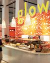
Glow By Supernature
A refreshing and immersive retail and dining experience for daily health and wellbeing needs.
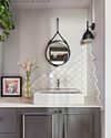
On-Trend Options To Consider
Small as it may be when compared to the rest of the home, the bathroom deserves pride of place because it is one place you can truly be on your own. So why not make it look spectacular with these touches.
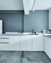
Cabinet Layout Ideas For An Open-Concept Kitchen
Breaking away from traditional enclosed cabinetry, these cabinet ideas offer a unique and refreshing approach that blends openness with functionality.

From Trash To Treasure
Designer Karyn Lim recounts her experience of creating the So Plast!c collection for the Designers & Crafters Edition 01 showcase co-curated by Industry+ and Sol Luminaire.
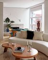
COOL VIBE IN MANHATTAN
Rising interior designer Matt McKay shares with KARINE MONIE how he drew inspiration from the 1960s and French design to create this apartment in Manhattan's West Village.
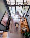
CITY LOFT
This bachelor pad feels like a Manhattan loft with its high ceiling, dark colour palette and a slight industrial edge.
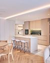
ROOMS FOR GROWTH
Smart lighting, minimalist material palette and clever spatial tweaks come together to create a cosy home with thoughtful considerations for the future. ASIH JENIE takes a tour.
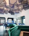
SAPPHIRE WINDOWS HEADQUARTERS AND SHOWROOM
The former factory warehouse is transformed into an elevated, grand and stunning showroom space, along with the Experiential Centre situated on Level Four.
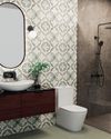
UNWIND IN SOPHISTICATION
In the unending chaos of our fast-paced world, the bathroom assumes its rightful place as a sanctuary for serenity.