
Grand Entrance
Where Four-room BTO in Buangkok
Home to a chef, who wanted an open-concept kitchen, his wife and their young daughter, Wee Studio reconfigured the orginal BTO layout to seamlessly combine the living room and kitchen, leaving half of the dining area visible through wooden slats that divide the latter and the entrance walkway with seating and shoe storage. Having such an open environment is the easiest way to make the most of natural light.
DESIGNATED DISPLAY
Where Four-room BTO in Jalan Tenteram
Not only did interior designer Joey Khu of Joey Khu Interior Design create sufficient space for a walk-in wardrobe by merging the master bedroom and an adjacent bedroom, he also left pockets of space in the wardrobe to allow the homeowner to neatly showcase her handbag collection.
LUXURY OF SPACE
Where Four-room BTO in McNair Road
Denne historien er fra March 2020-utgaven av Home & Decor Singapore.
Start din 7-dagers gratis prøveperiode på Magzter GOLD for å få tilgang til tusenvis av utvalgte premiumhistorier og 9000+ magasiner og aviser.
Allerede abonnent ? Logg på
Denne historien er fra March 2020-utgaven av Home & Decor Singapore.
Start din 7-dagers gratis prøveperiode på Magzter GOLD for å få tilgang til tusenvis av utvalgte premiumhistorier og 9000+ magasiner og aviser.
Allerede abonnent? Logg på

Building Spaces, Relationships, And Trust
Adrian Heng of Space One ID talks design evolution, his experiences in the industry, and the home that sparked his love for interior design.

Glow By Supernature
A refreshing and immersive retail and dining experience for daily health and wellbeing needs.
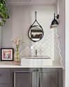
On-Trend Options To Consider
Small as it may be when compared to the rest of the home, the bathroom deserves pride of place because it is one place you can truly be on your own. So why not make it look spectacular with these touches.
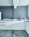
Cabinet Layout Ideas For An Open-Concept Kitchen
Breaking away from traditional enclosed cabinetry, these cabinet ideas offer a unique and refreshing approach that blends openness with functionality.

From Trash To Treasure
Designer Karyn Lim recounts her experience of creating the So Plast!c collection for the Designers & Crafters Edition 01 showcase co-curated by Industry+ and Sol Luminaire.
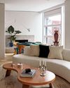
COOL VIBE IN MANHATTAN
Rising interior designer Matt McKay shares with KARINE MONIE how he drew inspiration from the 1960s and French design to create this apartment in Manhattan's West Village.
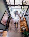
CITY LOFT
This bachelor pad feels like a Manhattan loft with its high ceiling, dark colour palette and a slight industrial edge.
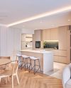
ROOMS FOR GROWTH
Smart lighting, minimalist material palette and clever spatial tweaks come together to create a cosy home with thoughtful considerations for the future. ASIH JENIE takes a tour.

SAPPHIRE WINDOWS HEADQUARTERS AND SHOWROOM
The former factory warehouse is transformed into an elevated, grand and stunning showroom space, along with the Experiential Centre situated on Level Four.
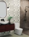
UNWIND IN SOPHISTICATION
In the unending chaos of our fast-paced world, the bathroom assumes its rightful place as a sanctuary for serenity.