
Project: Go Native, Bangalore;
Architects: HUNDRED HANDS, Bangalore
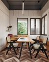
This long structure bifurcates two heavy brick buildings which house the services and utilities (kitchen, storerooms, restrooms, staff areas, etc). The details and the overall structure are articulated to highlight this repeating theme of contrast.
In a detailed interview with A+D, the architects reveal and share thoughtful insights about their recently completed project 'Go Native', located in Bengaluru:
The very short but meaningful tagline of "Go Native' stores/cafes reads 'EAT + SHOP + CONNECT'. Did you relate to these three functions separately or as a whole while conceptualising the project? How was it articulated into the overall design?
We didn't really reflect on the tagline, but the project brief always asked for a place to unwind-generous, open, filled with light and air and flexible. We capitalised on the required setbacks and the linear character of the site, with the fortuitously placed existing trees, to create a sequence of enclosed, semi-enclosed and open spaces for passage and pause. This idea of putting together a composition of contrasting conditions is at the heart of the project. One is always encountering different conditions of enclosure, opacity, robustness, colour, stability and so on.
What were your very first thoughts about the site? What were your impressions about the existing trees/ plants? was it retained with specific purposes or was it a general conservation?
This story is from the May 2022 edition of Architecture + Design.
Start your 7-day Magzter GOLD free trial to access thousands of curated premium stories, and 9,000+ magazines and newspapers.
Already a subscriber ? Sign In
This story is from the May 2022 edition of Architecture + Design.
Start your 7-day Magzter GOLD free trial to access thousands of curated premium stories, and 9,000+ magazines and newspapers.
Already a subscriber? Sign In

A GRECIAN RETREAT
Shimona Bhansali imbues a subtle touch of opulence to this home in Mumbai

A BOLD STATEMENT
Dhampur Sugar Mills Limited's workspace in New Delhi designed and built by Officebanao adopts an industrial narrative
A BREATH OF FRAGRANT DESIGN IN DELHI'S HEART
An office that smells like perfumery; that is the vision that TWI brought to life in this office space designed for an acclaimed perfume company in India

MASTER OF ALL TRADES
The ethos of forward-thinking and ingenuity finds its architectural counterpart within the walls of Nikhil Kamath and Abhijeet Pai's office-a vision of organic design infused with the essence of India

A TOUCH OF OPULENCE
Designed by Aparna Kaushik, this Delhi office displays an interesting balance of classic aesthetics and contemporary sensibilities

THE WOODEN WONDERLAND
Priyanka and Piyush Mehra envision a stunning experience centre for Vikas Plywood

THE HUB: BUILDING COMMUNITIES
Studio Lotus designs a dynamic mixed-use community hub that activates Chennai's largest IT Park

THE WINNER'S PERCH
Baldiwala Edge designs a Singapore-based ship broker's office as a torch collector's paradise, offering a 360-degree bird's-eye view of the Mumbai skyline

THE DIRECTOR'S CABIN
Designed by Envisage, this office gives a new definition to the traditional notion of biophilia

Designing Corporate India
From weaving the magic of a Star Trek-themed command centre to crafting bespoke block-printed workstations, Vijaya Bhargav and Arnab Ghosh-the trailblazing co-founders of Ostraca-have astonishingly transformed a staggering 29 million square feet of office space for India's tech giants and global enterprises-all while maintaining a flat hierarchical company culture-fuelling a master class in corporate design