The project is a new built, 4600sq ft built-up bungalow on a 7400sq ftland in SS3, one of the bigger residential suburbs of Petaling Jaya.

The clients were involved in the building industry and
The site didn’t pose any real problem as it was quite large and flat with no real major tree or vegetation to retain. There was an existing single storey bungalow on site which was demolished entirely. So basically, it was like a blank page with no site constraints. The main planning and orientation of the house was pretty much determined by the entrance and sun orientation: the pool and the public spaces of the house would face east, to get the morning sun. The other constraint/requirement was of course Feng Shui. Once a pretty workable layout was ready, the clients had to consult their Feng Shui consultant and the architects made a few tweaks to comply with the geomancy requirements.
We like to think we are very good at space planning and especially good at making small spaces look larger than they actually are. That’s one of the principles that the architects always try to adhere to—to have the minimum footprint as possible for the home while meeting all the space requirements. One of the tricks to make spaces look bigger is managing and maintaining the ‘line of sight’. We always try to enable the users to look from one space into the next and beyond. That’s why the double volume spaces and mezzanines are always encouraged. It enables all the levels of the house to interact visually with one another. Especially with homes with children; it’s always useful as you can always watch them wherever they are and shout at/for them. No excuse for them not hearing you.
This story is from the September 2016 edition of Architecture + Design.
Start your 7-day Magzter GOLD free trial to access thousands of curated premium stories, and 9,000+ magazines and newspapers.
Already a subscriber ? Sign In
This story is from the September 2016 edition of Architecture + Design.
Start your 7-day Magzter GOLD free trial to access thousands of curated premium stories, and 9,000+ magazines and newspapers.
Already a subscriber? Sign In
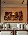
A RIVERSIDE SANCTUARY OF DESIGN AND ART
Perched along the Chao Phraya River, Capella Bangkok is an urban sanctuary crafted by Hamiltons International and BAMO, with art by Thai textile artist Ploenchan 'Mook' Vinyaratn-blending with Bangkok's cultural heartbeat to offer an experience that is both timeless and refined
THE SPORTING ICON
A manifesto of potential written in zinc, concrete, and imagination, this university sports arena showcases how thoughtful, innovative architecture can transform urban landscapes and foster a culture of excellence
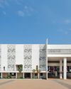
NATURE NURTURES LEARNING
Blending sustainability with innovative design, Morphogenesis' Vidyashilp Academy redefines educational spaces, fostering holistic development amidst Bengaluru's lush greenery
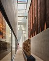
ME EPICENTER OF ART AND CULTURE
Arthshila at Okhla endeavours to epitomize the essence of exhibition spaces within the context of Delhi

SAKA MUSEUM: BRIDGING SILENCE, HERITAGE, AND DESIGN
From the celestial glow of its lobby to the grounded textures of volcanic rock, the SAKA Museum is a masterclass in thoughtful, place-based design. Under the vision of Wesley Ho, co-founder of the Hong Kong-based firm Napp Studio & Architects, this design-forward museum has evolved into a living, breathing narrative of Bali's identity

SCHUECO INDIA INAUGURATES ITS INDIA WELCOME FORUM IN DELHI NCR
A celebration of innovation, sustainability, and luxury in architecture

PIONEERING DESIGN EDUCATION FORA BETTER WORLD
To commemorate the 10th Anniversary of The Design Village - India's first social design school, we talk to the leadership at the institute that carries its pioneering vision of education for social impact, winning the Don Norman Design Recognition for humanity-centered design, representing the Global South.

DIVIANA DEBUTS IN MILAN: A Landmark In Indian Luxury Design
In an extraordinary milestone for Indian luxury and design, DIVIANA, a premier Indian luxury furniture brand, has opened its first European flagship showroom in Milan's prestigious Montenapoleone District, at Via Monte di Pietà 13/1. This 3200 sq. ft. space seamlessly blends the rich heritage of Indian craftsmanship with the refined aesthetics of Italian design, establishing a bold new narrative for global luxury.
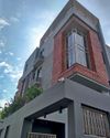
THE MASTER BUILDER
Architect Ayan Sen is committed to pushing the boundaries of design and innovation.

MASTERING THE ART OF DESIGN
In a candid chat with A+D, Nieves Contreras, Creative Director, Lladró speaks about her innate passion for design and her love for craftsmanship