The Headquarters of Société Privée de Gérance (SPG) in Geneva receives a new facelift, a rhythmic envelope that changes the looks of its dated façade.
A man stands before a non-descript building and partly closes his eyes so as to blur the lines of the box-shaped dark structure. He listens intently to what he calls the ‘murmurs’ that come from the landscape around him and to what his clients have to say. Having absorbed all that is necessary for his task ahead, he opens his eyes and knows what to do.
One can imagine that this might be the manner in which Italian architect, Giovanni Vaccarini (of the architecture studio Giovanni Vaccarini Architetti) conceived the design for the new Headquarters of Société Privée de Gérance (SPG) in Geneva.
When the reconversion and extension of SPG was complete, the design was based on a simple system that, when repeated, produced a complex multiplication of visions, both on the inside and outside of the building. In essence, with adaptive reuse, Vaccarini created a new façade and added extra floors. Today, SPG is a building that plays with light and gives a shimmering effect to the main body.
REPETITION AND RHYTHM
As magnificent as SPG now is, the story behind the creation of this structure is equally fascinating. Situated on the Route de Chêne, at the gates of the historical center of Geneva, one of the central themes for the architects is to enhance the quality of the work space inside the building. This, says Vaccarini, is what led him to completely redesign the exterior facade of the building.
This story is from the Issue 99 edition of d+a.
Start your 7-day Magzter GOLD free trial to access thousands of curated premium stories, and 9,000+ magazines and newspapers.
Already a subscriber ? Sign In
This story is from the Issue 99 edition of d+a.
Start your 7-day Magzter GOLD free trial to access thousands of curated premium stories, and 9,000+ magazines and newspapers.
Already a subscriber? Sign In

Tailored For The Curious Explorer
The new Alma House at the New Bahru enclave reflects the collaborative spirit of a school environment.
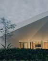
Eco And Egalitarian
Can a building represent a culture? Berrel Kräutler Architekten's sensitive renovation of the Embassy of Switzerland in Singapore stimulates discourse.
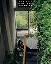
Building A Green Home
This semi-detached house by Zivy Architects explores passive tropical design, the delight in architecture and the issues of multi-generational living.
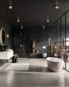
The Natural Balance
Inspired by the serene beauty of dewdrops, the Antao Collection by Villeroy & Boch transforms bathrooms into wellness sanctuaries, combining sustainability with timeless elegance.

Inspiring Creativity And Exploration
The new Hafary House at Lavender reflects the brand’s vibrancy and innovation, as well as provide an inspiring and engaging space for customers.
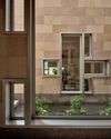
Home Is Where The Heart Is
A vacation house is reimagined for a multi-generational family to gather for holidays in the bucolic setting of Yongjia in Zhejiang, China.

balancing act: nature and humanity
In this inspiration-led series, we asked Jay Liu and Alex Liu, co-founders of Right Angle Studio, to dream up a unique interior concept using mainly items from Space Furniture.

rethinking, remaking, reframing
Aoki Akio, the founder of DESIGNART TOKYO discusses the importance and legacy of Tokyo's eminent art and design event, particularly for young creatives.

rebuilding communities
Shift2024, the much-anticipated conference returns with a stellar line-up of prolific architects making their mark in Asian urban design.

unparalleled italian craftsmanship
Filippo Arnaboldi, Chief Executive Officer of Frette, tells us how this luxury lifestyle Italian brand is moving forward with times yet not forgetting about its existing legacy.