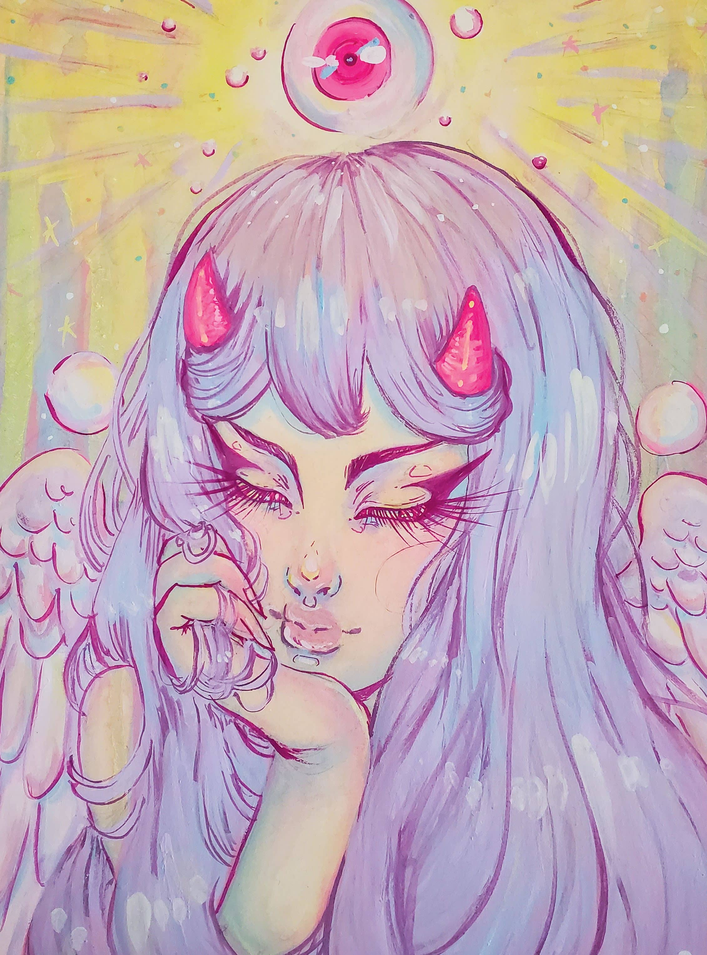
People often ask me why I only paint in shades of pastels even though most of my concepts feel dark and heavy, and where I get my pastel shades from. The answers lie in the fact that ever since I was little, I loved Japanese animation and how colourful the characters would be. Even now, I can’t help but enjoy the protagonist’s brightly coloured hair, going against the grain of all the other characters and I think that’s one of the many areas that influences my colour usage within art.
Over the years I’ve played with the juxtaposition of concept and colour, finding that masking my creations in softer hues helps lift the mood while still retaining the message of the piece. I recently stumbled across design gouache back in 2018. Before then I’d been using watercolours, but encountered many challenges when it came to the desaturation of colours when trying to paint in softer shades.
For those who aren’t familiar, design gouache is essentially opaque watercolour. These aren’t transparent like watercolours hence the word ‘opaque,’ but they reactivate when water is added and can blend in the same fashion as watercolours. They work differently than their gouache counterpart (acryla gouache). Acryla gouache can’t be reactivated when water is applied and is used in the same way as acrylic paint. Design gouache enables me to use similar painting techniques as watercolour that I’m most comfortable with, but still achieve lighter and brighter colours. If you’re looking into gouache, make sure you know the difference between the two types because it does affect how you can paint with them!
Bu hikaye ImagineFX dergisinin April 2020 sayısından alınmıştır.
Start your 7-day Magzter GOLD free trial to access thousands of curated premium stories, and 9,000+ magazines and newspapers.
Already a subscriber ? Giriş Yap
Bu hikaye ImagineFX dergisinin April 2020 sayısından alınmıştır.
Start your 7-day Magzter GOLD free trial to access thousands of curated premium stories, and 9,000+ magazines and newspapers.
Already a subscriber? Giriş Yap
PAINT EPIC BATTLES IN TRADITIONAL INK
Warhammer illustrator THOMAS ELLIOTT shows you how to create an epic science fiction fight scene with this step-by-step guide
CONJURE MAGIC ILLUSTRATIONS
Daria Anako demonstrates her process for creating a whimsical piece of art with some spellbinding touches
First Impressions
We discover the early influences that inspired the artist
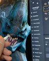
ZBrush for iPad
GAME CHANGER The desktop version of popular 3D sculpting software ZBrush has been redesigned for iPad - and it's brilliant

BenQ GW2786TC
GET AN EYEFUL Don't scrimp out on your health with a monitor that's kind on the eyes and good for creative tasks
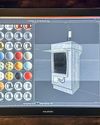
Huion Kamvas Pro 19
TABLET WARS An attractive pen display does an excellent job of balancing price and performance as it sets out to challenge its rivals in the mobile marketplace

DRAGON OFORCEC
Legendary D&D artist Larry Elmore explains the keys to crafting timeless fantasy art.
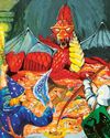
DUNGEON MASTERS
ImagineFX marks the milestone 50th anniversary of the launch of Dungeons & Dragons with a look at its rich tradition of illustration

Erik Ly
Gamer's haven Why the artist enjoys a maximalist aesthetic more than the minimalist approach.

2D meets 3D: How the workflows are merging
Interdimensional As VFX and animation evolve and tools become more accessible, Tanya Combrinck asks whether the separation between the mediums is reducing