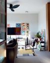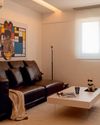
If you’re expecting a minimalist home feature, you might want to turn the page, because this project is more than just clean lines and neutral hues. For Anthony and his partner, minimalism is only “good on paper,” and their new one-bedroom condominium was always going to be about their prized possessions.
“We’ve collected a lot of things from our travels that we wanted to display, as opposed to hiding them away inside a cabinet. That alone told us this was not going to be a minimalist home,” said Anthony.
Their collection of textiles, for example, includes kilim rugs from Afghanistan and Pakistan, and woven table runners from Bhutan, Jordan, and Denmark. These items keep fond memories of their adventures close.
This approach meant that their interior designer, Wei Kai, had to design the space around the objects it would house, transforming the apartment into something of a gallery.
“The homeowners wanted to make it functional based on their lifestyles and avoid excessive built elements as they may clutter the place. The toughest part of the brief was bringing out their personalities while balancing their strong identities,” Wei Kai said.
They decided to boycott built-ins and use materials that complemented the homeowners’ collections. A muted colour palette was chosen—lowkey enough for their items to stand out while adding visual interest throughout the apartment.
You might notice this the moment you walk through the door and find yourself in the “foyer,” carved out with a mild steel panel and wire mesh. It demarcates the entryway, and a dining nook on the other side, where the homeowners’ penchant for patina makes its first appearance.
Bu hikaye SquareRooms dergisinin June 2024 sayısından alınmıştır.
Start your 7-day Magzter GOLD free trial to access thousands of curated premium stories, and 9,000+ magazines and newspapers.
Already a subscriber ? Giriş Yap
Bu hikaye SquareRooms dergisinin June 2024 sayısından alınmıştır.
Start your 7-day Magzter GOLD free trial to access thousands of curated premium stories, and 9,000+ magazines and newspapers.
Already a subscriber? Giriş Yap

Transform your laundry routine
Designed for the demands of modern urban living, Samsung’s Bespoke AI Laundry Combo redefines convenience by combining washing and drying in a single, space-saving unit.

Personal moments and timeless design
In a cosy flat filled with curated art and travel mementos, Amirul and Clarice's home tells a story of love, inspiration, and evolving tastes. From mid-century elements to modular classics, the couple shares how they shaped a space that reflects their journeys-and how it's still growing with them.

Old meets bold
Tim and Nicole were so enamoured with their Tiong Bahru rental that they bought it, preserving its midcentury charm while personalising the pre-war unit.

Branching out
With a tree at its centre and a mix of global influences across the ages, this home feels more like a living art gallery than a typical apartment.

Minimalist marvel
Thoughtfully designed by Ray Seah and Kate Sitchon, the space combines sleek aesthetics with practical solutions, offering the perfect balance of style and comfort.

Petite Paris
Channelling Parisian charm with a touch of Peranakan flair, this 4-room HDB flat looks like it belongs on the set of Emily in Paris.

Across the ages
In this one-of-a-kind home, the tastes of three generations— Baby Boomer, millennial, and Gen Z-converge.

Living artfully
Explore how Kave Home's Gala, Aiguablava, and Jondal collections bring together comfort, craftsmanship, and timeless style to transform any space into a haven of modern living.

A new chapter
Caesarstone adds 9 styles to its Porcelain Collection

The natural balance
Inspired by the serene beauty of dewdrops, the Antao Collection by Villeroy & Boch transforms bathrooms into wellness sanctuaries, combining sustainability with timeless elegance.