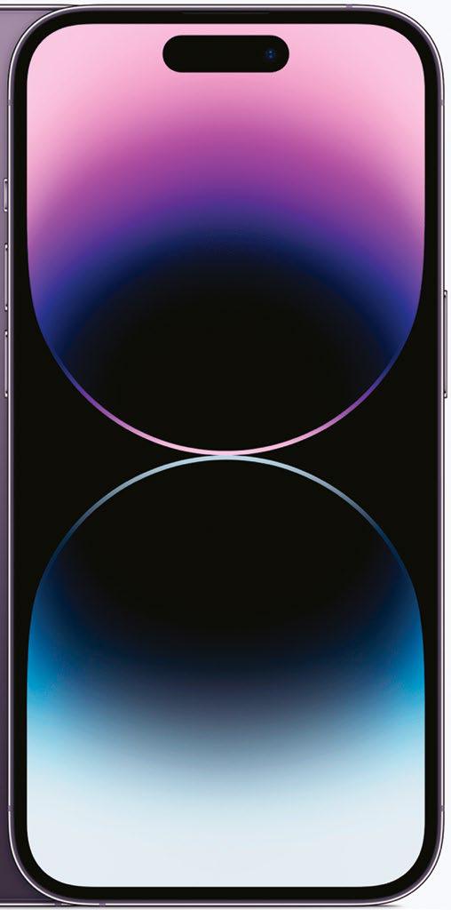
Outwardly, the new iPhone 14 Pro (and iPhone 14 Pro Max) share a lot in common with last year's iPhone 13 Pro model, though there are some key differences that set them apart, and a lot of these can be found in the 14 Pro's upgraded display. The first, and perhaps most obvious of these, is the new Dynamic Island which replaces the old, and somewhat universally-unloved notch. Dynamic Island is probably the biggest visual change to the way the front of the iPhone looks, but it's much more than just a prettier way of hiding the iPhone's front-facing camera and sensors, because, like a chameleon, it also changes and adapts to what's currently happening on your iPhone. For instance, if you're playing music, charging your device or connecting your AirPods, the bar will change size and display information specific to what's going on. It also reacts to your finger presses: if you tap the pill-shaped notch it'll take you to the app that's in focus, and if you hold down it'll shift size and shape to reveal more info about that app, and provide enhanced on-screen controls. It all sounds pretty in-your-face, but trust us - in action it's subtle enough to not be distracting, providing the right amount of feedback to make using your iPhone just that bit easier and more intuitive. If you don't want to interact with it, it doesn't get in the way.
هذه القصة مأخوذة من طبعة December 2022 من Mac Life.
ابدأ النسخة التجريبية المجانية من Magzter GOLD لمدة 7 أيام للوصول إلى آلاف القصص المتميزة المنسقة وأكثر من 9,000 مجلة وصحيفة.
بالفعل مشترك ? تسجيل الدخول
هذه القصة مأخوذة من طبعة December 2022 من Mac Life.
ابدأ النسخة التجريبية المجانية من Magzter GOLD لمدة 7 أيام للوصول إلى آلاف القصص المتميزة المنسقة وأكثر من 9,000 مجلة وصحيفة.
بالفعل مشترك? تسجيل الدخول
Belkin Auto-Tracking Stand Pro
Get your iPhone to follow your every move

Death Stranding Director's Cut
An outstanding horror tale

AirPods 4 with ANC
A new design and Active Noise Cancellation

iPhone 16 Pro
Bigger and better in almost every way

Apple, AirPods & your hearing health
Can AirPods Pro really be an effective alternative to traditional hearing aids?

What's next?
More Apple product releases and upgrades to come

KIT OUT YOUR HOME OFFICE
Create the perfect working environment in your own space

Create great movies now!
Turn your video clips into slickly edited stories with pro production values

Say hello to...macOS Sequoia
What’s new in macOS 15? What is Apple Intelligence, and what can it do for you: Will my Mac be able to run it? We tell you all this and more

Philips VoiceTracer Pen
Capture recordings and convert speech to text