
A homeowner's brief is A often like a wish list of things that he or she would like to convey to the interior designer when coming up with a design proposal for a new home. However, in the case of this 46-year-old civil servant, it was the reverse. "It was difficult for me to articulate what I wanted. Instead, I found it easier to tell the designer what I did not want," he says.
Among the things he did not want for his five-room flat was too many fixed furniture pieces, because he would like to reconfigure the space when he wanted to and add furniture pieces along the way. Ornate or frilly items are also a no-no; neither are elements that would collect dust or are a hassle to clean. While he likes open spaces, he did not want the entire apartment to be visible to visitors or outsiders.
The Artistroom team took all these into consideration, starting with the entrance foyer. It was formerly just an access corridor the previous owner had purchased from HDB, sandwiched between a gate and a door. By pushing the new main entrance all the way out and adding a built-in shoe rack and bench, the space is now a proper entrance foyer that welcomes visitors to the home.
Behind the bench is the kitchen, separated from the foyer by a half-height parapet wall with sliding glass panels that partially screen off the rest of the interior from prying eyes.
Diese Geschichte stammt aus der February 2023-Ausgabe von Home & Decor Singapore.
Starten Sie Ihre 7-tägige kostenlose Testversion von Magzter GOLD, um auf Tausende kuratierte Premium-Storys sowie über 8.000 Zeitschriften und Zeitungen zuzugreifen.
Bereits Abonnent ? Anmelden
Diese Geschichte stammt aus der February 2023-Ausgabe von Home & Decor Singapore.
Starten Sie Ihre 7-tägige kostenlose Testversion von Magzter GOLD, um auf Tausende kuratierte Premium-Storys sowie über 8.000 Zeitschriften und Zeitungen zuzugreifen.
Bereits Abonnent? Anmelden

Building Spaces, Relationships, And Trust
Adrian Heng of Space One ID talks design evolution, his experiences in the industry, and the home that sparked his love for interior design.

Glow By Supernature
A refreshing and immersive retail and dining experience for daily health and wellbeing needs.
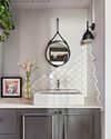
On-Trend Options To Consider
Small as it may be when compared to the rest of the home, the bathroom deserves pride of place because it is one place you can truly be on your own. So why not make it look spectacular with these touches.
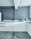
Cabinet Layout Ideas For An Open-Concept Kitchen
Breaking away from traditional enclosed cabinetry, these cabinet ideas offer a unique and refreshing approach that blends openness with functionality.

From Trash To Treasure
Designer Karyn Lim recounts her experience of creating the So Plast!c collection for the Designers & Crafters Edition 01 showcase co-curated by Industry+ and Sol Luminaire.
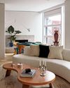
COOL VIBE IN MANHATTAN
Rising interior designer Matt McKay shares with KARINE MONIE how he drew inspiration from the 1960s and French design to create this apartment in Manhattan's West Village.
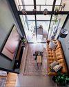
CITY LOFT
This bachelor pad feels like a Manhattan loft with its high ceiling, dark colour palette and a slight industrial edge.
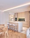
ROOMS FOR GROWTH
Smart lighting, minimalist material palette and clever spatial tweaks come together to create a cosy home with thoughtful considerations for the future. ASIH JENIE takes a tour.

SAPPHIRE WINDOWS HEADQUARTERS AND SHOWROOM
The former factory warehouse is transformed into an elevated, grand and stunning showroom space, along with the Experiential Centre situated on Level Four.
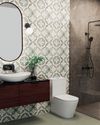
UNWIND IN SOPHISTICATION
In the unending chaos of our fast-paced world, the bathroom assumes its rightful place as a sanctuary for serenity.