Intentar ORO - Gratis
DTP Principles - Design Special

Vuélvete ilimitado con Magzter GOLD
Leer DTP Principles junto con más de 9000 revistas y periódicos con una sola suscripción
Ver catálogoSuscríbete sólo a DTP Principles
Cancelar en cualquier momento.
(Sin compromisos) ⓘSi no estás satisfecho con tu suscripción, puedes enviarnos un correo electrónico a help@magzter.com dentro de los 7 días posteriores a la fecha de inicio de la suscripción para recibir un reembolso completo. ¡Sin preguntas, lo prometemos! (Nota: No se aplica a compras de números individuales)
Suscripción digital
Acceso instantáneo ⓘSuscríbete ahora para comenzar a leer instantáneamente en el sitio web de Magzter, iOS, Android y las aplicaciones de Amazon.
En este número
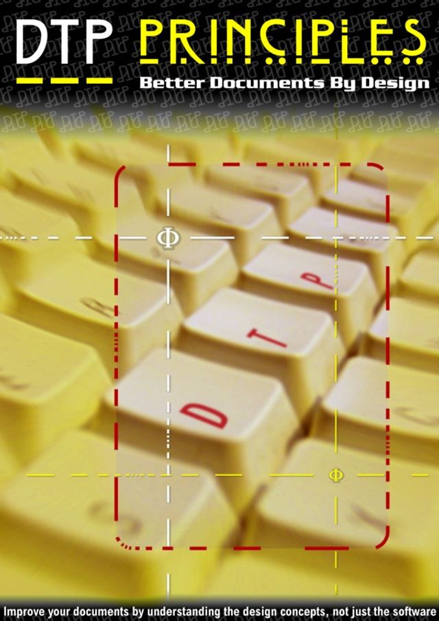
Learn the principles of DTP with DTP Principles; a non-platform specific exploration of the secrets behind effective page layout. Deliberately written to avoid mention of any specific package, it's suitable for all computer users whether PC, Mac or Linux.
DTP Principles Description:
Welcome to DTP Principles, a special guide that tries to help DTP users improve the impact of documents by making informed design decisions.
Many special magazine features on DTP, as well as full handbooks on the subject, tend to concentrate on using the ‘DTP package of the moment’, or make a point of using one computer operating system at the expense of another. They generally concentrate on showing you how to produce fancy graphical layouts and eye-catching designs by using the latest and most advanced features that are available in the newest DTP software.
DTP Principles is different. You’ll find
nothing in this guide about individual DTP
packages. You’ll find nothing whatsoever about the choice of computer or operating system. You’ll even find precious little about using the graphical features available in your choice of DTP package. What you will find, though, is plenty of information about how to make sensible decisions concerning the more fundamental aspects of your design, and how to treat your document’s text with respect, so that your pages read impressively as well as looking good.
Flashy graphics and colourful layouts are all very well, but they’re of little benefit if your text presentation lacks appropriate care and attention. This guide therefore discusses such matters as how to handle punctuation correctly, how to decide on line length and spacing, how to choose appropriate fonts for different situations, and lots of other text related choices. The final section, on the Golden Ratio, presents some valuable information which is relevant to all aspects of design. There’s lots to read, and I hope that even experienced DTP practitioners will find something of value here.
Títulos relacionados

T3 UK

MacFormat UK

What Hi-Fi UK

BBC Science Focus

Classic & Sports Car

What Car? UK

PC Pro

Practical Boat Owner

Stuff UK

BBC Sky at Night Magazine

Edge UK

Essential Guide to Outdoor photography

The Ultimate Guide To Android Tablets

The Photographer's Guide to Photoshop

Pocket Guide to Digital Photography

The Ultimate Guide to Graphic Design

Nokia Smartphones

The Independent Guide to the Mac

Ultimate Guide to Cloud Computing

The Ultimate Guide to Bicycle Maintenance

Linux The Complete Manual 2nd edition

The Ultimate Guide to Digital Photography

Build a better PC 2011

The Complete Guide to the iPad mini

Ultimate Guide to Microsoft Office 2010

The Complete Guide to the iPad 4

The Ultimate Guide to BlackBerry

The Ultimate Guide to Windows 8

The Complete Guide to the iPad 2

The Complete Guide to the iPad 3


