
Shophouse renovations present multiple challenges. In this project, Plystudio Architects has provided a case study of how to tackle conservation requirements and create a liveable interior for its new inhabitants while maintaining the intrinsic, desirable qualities of the vernacular building type.
The 280 sqm shophouse in the Blair Plans conservation area was formerly a vehicle workshop when it was first built in the 1930s before it became a dwelling. The current homeowners wanted to continue its use as a home but needed to tailor it to their specific requirements.
“The clients are business owners who live with an elderly, wheelchair-bound parent and a lived-in helper. The brief called for a rebuild of the shophouse’s rear section and better utilisation of the different levels,” says Jacqueline Yeo, who runs the architecture firm together with her husband Victor Lee.
focal point
They kept the front façade, following regulatory guidelines, but repaired key elements such as timber shutter windows and door panelling motifs. At the rear is a new, three-storey extension with its first storey slightly sunken so that the height of its roof could be kept at the same level of the old structure at the front. This was a conservation guideline the architects had to adhere to.
There was another reason for the creation of separate front and rear blocks. The rear’s first storey lower height had already existed as the backlane was 1.4m lower than the road at the front of the shophouse.
Rather than a sharp dip at the rear, the architects created an airwell in the centre where a split-level of steps and short bridges become important devices connecting the two blocks seamlessly while mitigating the level differences. In this void, a new staircase unfolds upward to a skylight.
Esta historia es de la edición Issue 134 de d+a.
Comience su prueba gratuita de Magzter GOLD de 7 días para acceder a miles de historias premium seleccionadas y a más de 9,000 revistas y periódicos.
Ya eres suscriptor ? Conectar
Esta historia es de la edición Issue 134 de d+a.
Comience su prueba gratuita de Magzter GOLD de 7 días para acceder a miles de historias premium seleccionadas y a más de 9,000 revistas y periódicos.
Ya eres suscriptor? Conectar

Tailored For The Curious Explorer
The new Alma House at the New Bahru enclave reflects the collaborative spirit of a school environment.
Eco And Egalitarian
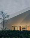
Can a building represent a culture? Berrel Kräutler Architekten's sensitive renovation of the Embassy of Switzerland in Singapore stimulates discourse.
Building A Green Home
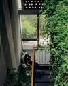
This semi-detached house by Zivy Architects explores passive tropical design, the delight in architecture and the issues of multi-generational living.
The Natural Balance
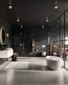
Inspired by the serene beauty of dewdrops, the Antao Collection by Villeroy & Boch transforms bathrooms into wellness sanctuaries, combining sustainability with timeless elegance.

Inspiring Creativity And Exploration
The new Hafary House at Lavender reflects the brand’s vibrancy and innovation, as well as provide an inspiring and engaging space for customers.
Home Is Where The Heart Is
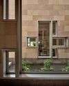
A vacation house is reimagined for a multi-generational family to gather for holidays in the bucolic setting of Yongjia in Zhejiang, China.

balancing act: nature and humanity
In this inspiration-led series, we asked Jay Liu and Alex Liu, co-founders of Right Angle Studio, to dream up a unique interior concept using mainly items from Space Furniture.

rethinking, remaking, reframing
Aoki Akio, the founder of DESIGNART TOKYO discusses the importance and legacy of Tokyo's eminent art and design event, particularly for young creatives.

rebuilding communities
Shift2024, the much-anticipated conference returns with a stellar line-up of prolific architects making their mark in Asian urban design.

unparalleled italian craftsmanship
Filippo Arnaboldi, Chief Executive Officer of Frette, tells us how this luxury lifestyle Italian brand is moving forward with times yet not forgetting about its existing legacy.