試す 金 - 無料
Project: Someone London For Simmons & Simmons
Computer Arts - UK
|January 2020
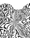
Discover how SomeOne London came up with the perfect visual metaphor in its identity work for the progressive law firm Simmons & Simmons
-

THE BRIEF
Simon Manchipp
Simmons & Simmons is a global legal practice founded in 1896, with over 1,500 people in 21 offices throughout Europe, the Middle East and Asia. The company held a strategic pitch where we met and discussed the opportunities that face law firms and how we would begin to look at the project. It was a perfect process, a series of smart conversations where we both began to see how good it would be to work together on the company’s new identity.
We started our research by consulting with the entire partnership, in person, interviewing, filming and holding workshops with clients and staff throughout the process. Working in Amsterdam, Paris, Prague, Hong Kong and London we saw a real hunger for a brand born from digital beginnings, that moves and adapts to a broad spectrum of clients and demands.

The company is progressive and inventive. It’s been the highest ranked law firm on the Stonewall Workplace Equality and on The Times Top 50 Employers for Women list, which shows its commitment to equality in the workplace. It also practises some of the most progressive techniques in law through the application of intelligent collaboration to give its clients smarter solutions, around the world. This was the direction we set out to amplify and exemplify through the visual and verbal brand identity.
Branding and communication in the legal sector can be outdated and cumbersome, so we looked beyond to find a better way to engage audiences in conversations about collaboration and partnership.

このストーリーは、Computer Arts - UK の January 2020 版からのものです。
Magzter GOLD を購読すると、厳選された何千ものプレミアム記事や、10,000 以上の雑誌や新聞にアクセスできます。
すでに購読者ですか? サインイン
Computer Arts - UK からのその他のストーリー
Computer Arts - UK
Creative Space
Without’s creative director roly grant on the studio’s hand-crafted ethos
2 mins
June 2020
Computer Arts - UK
studio profile
A leading light in the branding industry, Wolff Olins wants to harness its scale to help change the world
8 mins
June 2020

Computer Arts - UK
network
THE CREATIVE COMMUNITY HAS COME TOGETHER LIKE NEVER BEFORE, TO HELP EACH OTHER GET THROUGH THE CORONAVIRUS PANDEMIC
2 mins
June 2020

Computer Arts - UK
project
ethos for 305 Fitness - Learn how the Montreal identity design studio rebranded one of America’s hottest fitness clubs
5 mins
June 2020

Computer Arts - UK
rebrand
WHAT’S THE EXPERT OPINION ON PENTAGRAM’S BRAND IDENTITY REFRESH OF THE GLOBAL TOY COMPANY FISHER-PRICE?
3 mins
June 2020
Computer Arts - UK
opinion
CRAIG BLACK HAS SOME ADVICE FOR SURVIVING THE CORONAVIRUS CRISIS AS AN INDEPENDENT CREATIVE
5 mins
June 2020

Computer Arts - UK
fresh eyes
DUNCAN BRAZZIL ON HOW THE UK INSPIRED HIS CAREER
1 min
June 2020

Computer Arts - UK
artist insight
Cindy Kang on how photography informs her illustration work
5 mins
June 2020
Computer Arts - UK
ANIMATION NOW
LEADING PRODUCERS AND FILMMAKERS REFLECT ON EMERGING TRENDS AND SHARE THEIR PREDICTIONS FOR THE YEAR AHEAD
17 mins
June 2020
Computer Arts - UK
Project: Atoll by Studio Myerscough
Morag Myerscough reveals how she and Luke Morgan designed a vibrant biophilic installation in a central London office tower studiomyerscough.com
4 mins
May 2020
Translate
Change font size

