CATEGORIES
Kategoriler
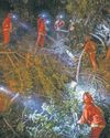
Bureaucratic Tangle Made It Harder to Clear Brush
Barry Josephson enjoyed a peaceful life in his hilltop home in the Pacific Palisades, save for one constant worry: the highly flammable brush that clogged the surrounding government-owned land.

Fire Inspectors Catalog Extent of the Damages
The assessments can be a family's first official word on their house's fate

Beijing Signals Openness to Deal For TikTok in U.S.
China suggested it was willing to work with President Trump to keep TikTok operating in the U.S.

Art and Fire
What steps do museums take to protect their collections from calamity?
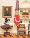
A Tour Inside Trump's Oval Office—Version 2.0
President Trump's redecorated Oval Office includes a portrait of Benjamin Franklin and a fresh Andrew Jackson painting, part of an Inauguration Day overhaul of the most exclusive office space in America.

Kohl's Shoppers Want Return of Old Store
Kohl's shoppers have a message for incoming Chief Executive Ashley Buchanan: Bring back the old Kohl's.

J.B. Hunt's Earnings Log Increase
J.B. Hunt Transport Services defied a weak U.S. freight market to post a higher profit in the fourth quarter, although overall revenue fell as lower revenue per load more than offset volume gains.

TESTING GROUND
Sanaz Toossi brings English, her play about the trials of learning a new language, to Broadway.

Meta: No Community Notes on Paid Ads
Facebook and Instagram owner Meta Platforms assured advertisers last week that its \"Community Notes,\" which will let users crowdsource annotations on posts that they believe are false or need context, won't apply to paid ads when they arrive later this year, according to people with direct knowledge of the conversations.

Chicago Braces for Raids, Deportations
CHICAGO-The nation's third-largest city has been bracing for Donald Trump's second White House tour since

Nintendo Sticks to Its Winning Formula
Past product launches hold valuable lessons for the company as gamers get an early look at the long-awaited Switch 2

U.S. Gas Exporter Plans $2.3 Billion IPO
Move could value Venture Global at $110 billion on heels of Trump's return

Tech Giants Enter New Frenemy Era
The start of Trump 2.0 marks a new Frenemy Era for tech giants.
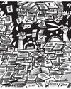
DOGE's Challenge Is Gargantuan
Take a peek at what all those bureaucrats are doing, from watermelons and whales to wampum. ee

Memoirs From Mutti
Angela Merkel served as chancellor of Germany for four consecutive four-year terms, from 2005 to 2021.

ATLAS SHRUGGED
A brawny bodybuilder with a generous side: atypical Wall Street sage. But as CIO of Scott Minerd was an Guggenheim Partners, he oversaw billions for the firm and made millions for himself to him and His sudden death shocked spurred infighting over his $400 million estate even those closest

Behind THE PODIUM
As President Biden's barrier-breaking press secretary leaves the White House, she considers the ups and downs of being a first

Antsy Officials Get A New Xi Message: To Err Is Human
Chinese leader Xi Jinping is intensifying a war on corruption that has punished officials in record numbers-with the side effect of leaving many unwilling to act for fear of punishment.

He Drove His Jeep To 49 States in 64 Days-and He's 18
AJay Bentley, 18, a high-school senior living in Edwards, Colo., on his 2022 Jeep Wrangler Sahara, as told to A.J. Baime.

Trump Orders Changes in Border, Energy, DEI Plans
President Trump signed executive orders to overhaul border and energy policies and end diversity programs across the federal government, unwinding signature Biden administration policies on the first day of his second term.

Hamas Retakes Effective Control of Gaza
Cease-fire, lack of alternatives give group a moment to assert power
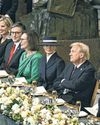
Defiant Trump Regains Power
New president is sworn in to cap remarkable comeback

Happenings for the Week of January 21
Film \"Flight Risk\" (Jan. 24): Mel Gibson is back in the director's chair for the first time in nine years with an action story about an air marshal guarding an important witness as a pilot takes them over the Alaskan wilderness. The cast includes Mark Wahlberg, Topher Grace, Michelle Dockery and Paul Ben-Victor.

MIRACLE DRIP
NAD+ infusions have become increasingly popular, promising to magically turn back the clock. But are they too good to be true? Mattie Kahn investigates.

From A to Zac
Zac Posen's arrival at Gap was a surprise to many, yet the former wunderkind of New York fashion is loving every minute of his new life. Irina Aleksander meets him as he goes big and gets ready to dress America.

Chiefs and Bills Book Another Epic Matchup
Here it comes, the brightly-lit rematch the NFL craved, back-to-back Super Bowl champ versus regular nemesis, AFC seed No. 1 vs. seed No. 2, outrageous quarterback here, outrageous quarterback there, ludicrously passionate fan bases including table-breaking mafiosos and a certain Nashville-based pop songstress, rich history, old anguish, frigid weather, icicle mustaches, adults making terrible decisions to stand shirtless out-doors...

Through the Looking Glass
Sam McKinniss's Connecticut home is a magical, maximalist mash-up, tying together riotous color, throwback Americana, and the artist's uncanny visions of popular culture.

Girls, INTERRUPTED
Nestled in the Berkshires, with a pedigree dating back to 1898, MISS HALL'S SCHOOL appears to be a cocoon of safety and formative tutelage for its students, all of them young women. But for decades, an alleged sexual predator operated on campus. Now alumnae are speaking out in hopes of holding their former teacher-and the school-accountable

MAN ON WIRE
ADRIEN BRODY IS DRAWN TO HIGH-RISK ROLES AND FILMS THAT PUSH HIM TO EXTREMES. NOTHING HE'S DONE COMPARES TO THE BRUTALIST.

Beaten Down Under Biden, Drug-Sector Hopes for New Start
The past two years have been punishing for the biotech and pharma space.