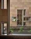
When architect Sanjay Puri was tasked with designing a multi-level, mixed-use building in Ahmedabad in Gujarat, India, he said that his brief was “very specific”.
The client, Dushyant Goswami from the city developer Suvidha Projects, wanted a structure that housed road-facing retail spaces as well as office spaces that measured 400 to 800ft2 each.
The developer also wanted a 5,000ft2 office for itself and requested for the building to be highly visible and suitable for the site’s location and climate.
The resulting construction, Stellar, was completed in 2019 after four years of work.
A rectilinear, 110m-long commercial building, it features retail spaces at the lower three levels, and office spaces at the remaining, upper four levels.
ALL ABOUT VISIBILITY
“The site faces out onto an arterial city road and the client wanted the retail spaces to make full use of the extensive road frontage,” says Puri, who led the project.
“In addition, the building was developed for sale, and because retail spaces are generally sold at a much higher price than office spaces, with ground-floor retail spaces being the most expensive, it was important for us to make sure that the retail floors were highly visible.”
To this end, Puri designed the building to accommodate as many retail spaces as possible. He also created direct entry to these spaces from the road.
A long and wide footpath flanks the road-facing north side of the building, ensuring that pedestrians have a clear view of the shop-fronts.
“People in small cities such as this one prefer road-facing shops with high visibility, so we had to get this aspect of the brief right,” Puri says.
Denne historien er fra Issue 115-utgaven av d+a.
Start din 7-dagers gratis prøveperiode på Magzter GOLD for å få tilgang til tusenvis av utvalgte premiumhistorier og 9000+ magasiner og aviser.
Allerede abonnent ? Logg på
Denne historien er fra Issue 115-utgaven av d+a.
Start din 7-dagers gratis prøveperiode på Magzter GOLD for å få tilgang til tusenvis av utvalgte premiumhistorier og 9000+ magasiner og aviser.
Allerede abonnent? Logg på

Home Is Where The Heart Is
A vacation house is reimagined for a multi-generational family to gather for holidays in the bucolic setting of Yongjia in Zhejiang, China.

the natural balance
Inspired by the serene beauty of dewdrops, the Antao Collection by Villeroy & Boch transforms bathrooms into wellness sanctuaries, combining sustainability with timeless elegance.

inspiring creativity and exploration
The new Hafary House at Lavender reflects the brand’s vibrancy and innovation, as well as provide an inspiring and engaging space for customers.

balancing act: nature and humanity
In this inspiration-led series, we asked Jay Liu and Alex Liu, co-founders of Right Angle Studio, to dream up a unique interior concept using mainly items from Space Furniture.

rethinking, remaking, reframing
Aoki Akio, the founder of DESIGNART TOKYO discusses the importance and legacy of Tokyo's eminent art and design event, particularly for young creatives.

rebuilding communities
Shift2024, the much-anticipated conference returns with a stellar line-up of prolific architects making their mark in Asian urban design.

unparalleled italian craftsmanship
Filippo Arnaboldi, Chief Executive Officer of Frette, tells us how this luxury lifestyle Italian brand is moving forward with times yet not forgetting about its existing legacy.

where the mountain meets the sea
This bespoke hillside residence features modern design elements, natural touches, and panoramic ocean views.

tailored for the curious explorer
The new Alma House at the New Bahru enclave reflects the collaborative spirit of a school environment.

tranquil sanctuary
The recently launched Banyan Tree Higashiyama Kyoto, designed by Kengo Kuma, fuses traditional Japanese architecture with modern elegance.