HASHIM AKIB ’s new series features exercises for creating stylish, modern portraits. Here he shows how to use vibrant colours without overpowering a painting

One of the main issues when painting any skin tone is the lack of strong colour. White is generally over-used to create pastel tints that can look chalky and dull. For darker skin tones, some may overuse Burnt Umber. Beginners may even be tempted to plump for a tube of Flesh Tint, which in no way is representative of the multitude of real-life skin pigments.
Skin tones tend to look consistent from distance and colour may come from an accessory someone is wearing or a shot of colour in the background. On closer inspection, skin has a variety of subtle hues. These colours can be affected by illness, bruising, light, temperature, or reflected colour and can vary with age. Initially it’s important to simply be open to seeing these variations.
Painting portraits with acrylics can be tricky. Whereas oils allow for excessive blending and feathering, acrylics can appear flat if the pigment is overworked. In order to retain colour brilliance, try to be more decisive with your brushstrokes. This can be difficult when a certain amount of accuracy is involved, so it may be that you make allowances for the drawing in order to create a more effective overall painting. Some of my favourite portraits bear less of a resemblance to the sitter, but it’s normally the case that the reference material isn’t on show with the painting. Commissions often require an accurate representation but, if you’re starting out, get lots of practise under your belt before worrying about this.
EXERCISE 1
AIM
Here is an exercise to explore a richer palette of strong, warm colours. Darker skin tones are a great place to start if you want to use more saturated colour. With less pastel tints, colours will have a chance to spark to life.
MATERIALS
Denne historien er fra September 2019-utgaven av Artists & Illustrators.
Start din 7-dagers gratis prøveperiode på Magzter GOLD for å få tilgang til tusenvis av utvalgte premiumhistorier og 9000+ magasiner og aviser.
Allerede abonnent ? Logg på
Denne historien er fra September 2019-utgaven av Artists & Illustrators.
Start din 7-dagers gratis prøveperiode på Magzter GOLD for å få tilgang til tusenvis av utvalgte premiumhistorier og 9000+ magasiner og aviser.
Allerede abonnent? Logg på

Still life IN 3 HOURS
Former BP Portrait Award runner-up FELICIA FORTE guides you through a simple, structured approach to painting alla prima that tackles dark, average and light colours in turn
Movement in composition
Through an analysis of three masterworks, landscape painter and noted author MITCHELL ALBALA shows how you can animate landscape composition with movement
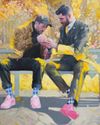
Shane Berkery
The Irish-Japanese artist talks to REBECCA BRADBURY about the innovative concepts and original colour combinations he brings to his figurative oil paintings from his Dublin garden studio
The Working Artist
Something old, something new... Our columnist LAURA BOSWELL has expert advice for balancing fresh ideas with completing half-finished work
Washes AND GLAZES
Art Academy’s ROB PEPPER introduces an in-depth guide to incorporating various techniques into your next masterpiece. Artwork by STAN MILLER, CHRIS ROBINSON and MICHELE ILLING

Hands
LAURA SMITH continues her new four-part series, which encourages you to draw elements of old master paintings, and this month’s focus is on capturing hands

Vincent van Gogh
To celebrate The Courtauld’s forthcoming landmark display of the troubled Dutch master’s self-portraits, STEVE PILL looks at the stories behind 10 of the most dramatic works on display
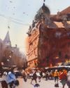
BRING THE drama
Join international watercolour maestro ALVARO CASTAGNET in London’s West End to paint a dramatic street scene
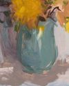
Serena Rowe
The Scottish painter tells STEVE PILL why time is precious, why emotional responses to colour are useful, and how she finds focus every day with the help of her studio wall
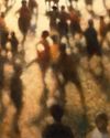
Bill Jacklin
Chatting over Zoom as he recovers from appendicitis, the Royal Academician tells STEVE PILL about classic scrapes in New York and his recent experiments with illustration