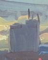
HUE: WARMER COLOURS ADVANCE, COOLER COLOURS RECEDE
In figure 1, warm colour is flanked by two colours that get progressively cooler as they move away from the centre. All three are equal in saturation (bright muted colours) and value (around mid-tone). There are no linear signifiers such as overlap, size variation, or perspective to influence the spatial hierarchy, so hue is the only active agent in this example. The yellow-orange at the centre seems to advance while its neighbouring colours recede.
VALUE: DARKER COLOURS ADVANCE, LIGHTER COLOURS RECEDE
Figure 2 shows three colours unalike in value, but similar in hue and saturation. The dark colour at the centre does seem to dominate the visual field, but you can also flip the figure-ground relationship in your mind and see the dark centre colour as dropping back behind two lighter panels. This suggests that value may be a more equivocal spatial indicator than hue or saturation.
SATURATION: PURER COLOURS ADVANCE, DULLER COLOURS RECEDE
Figure 3 below shows three colours that are disparate in saturation, but similar in hue and value. The centre colour, a prismatic red, appears to advance in relation to its neighbours.
All three of these assertions are true under the right circumstances. But, as often happens, when a colour is light in value (receding) and warm in temperature (advancing), or warm in hue (advancing) and dull in saturation (receding), these “rules” come into conflict with each other.
Denne historien er fra August 2020-utgaven av Artists & Illustrators.
Start din 7-dagers gratis prøveperiode på Magzter GOLD for å få tilgang til tusenvis av utvalgte premiumhistorier og 9000+ magasiner og aviser.
Allerede abonnent ? Logg på
Denne historien er fra August 2020-utgaven av Artists & Illustrators.
Start din 7-dagers gratis prøveperiode på Magzter GOLD for å få tilgang til tusenvis av utvalgte premiumhistorier og 9000+ magasiner og aviser.
Allerede abonnent? Logg på

Still life IN 3 HOURS
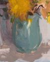
Former BP Portrait Award runner-up FELICIA FORTE guides you through a simple, structured approach to painting alla prima that tackles dark, average and light colours in turn

Movement in composition
Through an analysis of three masterworks, landscape painter and noted author MITCHELL ALBALA shows how you can animate landscape composition with movement

Shane Berkery
The Irish-Japanese artist talks to REBECCA BRADBURY about the innovative concepts and original colour combinations he brings to his figurative oil paintings from his Dublin garden studio

The Working Artist
Something old, something new... Our columnist LAURA BOSWELL has expert advice for balancing fresh ideas with completing half-finished work

Washes AND GLAZES
Art Academy’s ROB PEPPER introduces an in-depth guide to incorporating various techniques into your next masterpiece. Artwork by STAN MILLER, CHRIS ROBINSON and MICHELE ILLING

Hands
LAURA SMITH continues her new four-part series, which encourages you to draw elements of old master paintings, and this month’s focus is on capturing hands

Vincent van Gogh
To celebrate The Courtauld’s forthcoming landmark display of the troubled Dutch master’s self-portraits, STEVE PILL looks at the stories behind 10 of the most dramatic works on display

BRING THE drama
Join international watercolour maestro ALVARO CASTAGNET in London’s West End to paint a dramatic street scene

Serena Rowe
The Scottish painter tells STEVE PILL why time is precious, why emotional responses to colour are useful, and how she finds focus every day with the help of her studio wall

Bill Jacklin
Chatting over Zoom as he recovers from appendicitis, the Royal Academician tells STEVE PILL about classic scrapes in New York and his recent experiments with illustration