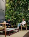
Shanghai has an exuberant new co-work venue: a collaboration between Linehouse and the WeWork in house design team, WeWork Weihai Lu melds history with modernity, opulence with tactility, and fiction with function.

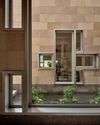
Along Shanghai’s Weihai Lu sits an industrial brick building, surrounded by ‘longtangs’ (traditional lane houses). Its aged demeanour belies an exciting, new function, as suggested by the words ‘Creatives Welcome’ scribbled in neon light on the historical Chinese stone arches above the entryway. This is the location of WeWork Weihai Lu, the China flagship of American co-work space and service provider WeWork.
Started in 2010 in New York City, WeWork has more than 100,000 members spread across 130 locations worldwide. Their success is reflective of the workspace sharing practice, now a common and necessary industry model for freelance workers, small creative industries, entrepreneurs and start-up companies fuelled by today’s mobile technology and culture.
WeWork is known for picking heritage spaces and transforming them into attractive collaborative work environments. “WeWork loves the charm and characteristics of older buildings. Our design approach is to find ways to bring the building to life, let it be what it is and show off the way it was constructed rather than hiding it behind finishes or with heavy handed interventions,” says Ashley Couch, Senior Associate, Director of Interior Design at WeWork.
Their Shanghai branch has an interesting past as a warehouse for the East India Company, artist studios and galleries, and an opium storage facility in the 1930s. In response, the design team took a page from the city’s 1920/1930s belle époque period when fashion and architecture embraced a mix of Eastern and Western influences.
Denne historien er fra Issue 98-utgaven av d+a.
Start din 7-dagers gratis prøveperiode på Magzter GOLD for å få tilgang til tusenvis av utvalgte premiumhistorier og 9000+ magasiner og aviser.
Allerede abonnent ? Logg på
Denne historien er fra Issue 98-utgaven av d+a.
Start din 7-dagers gratis prøveperiode på Magzter GOLD for å få tilgang til tusenvis av utvalgte premiumhistorier og 9000+ magasiner og aviser.
Allerede abonnent? Logg på

The Natural Balance
Inspired by the serene beauty of dewdrops, the Antao Collection by Villeroy & Boch transforms bathrooms into wellness sanctuaries, combining sustainability with timeless elegance.

Inspiring Creativity And Exploration
The new Hafary House at Lavender reflects the brand’s vibrancy and innovation, as well as provide an inspiring and engaging space for customers.

Home Is Where The Heart Is
A vacation house is reimagined for a multi-generational family to gather for holidays in the bucolic setting of Yongjia in Zhejiang, China.

balancing act: nature and humanity
In this inspiration-led series, we asked Jay Liu and Alex Liu, co-founders of Right Angle Studio, to dream up a unique interior concept using mainly items from Space Furniture.

rethinking, remaking, reframing
Aoki Akio, the founder of DESIGNART TOKYO discusses the importance and legacy of Tokyo's eminent art and design event, particularly for young creatives.

rebuilding communities
Shift2024, the much-anticipated conference returns with a stellar line-up of prolific architects making their mark in Asian urban design.

unparalleled italian craftsmanship
Filippo Arnaboldi, Chief Executive Officer of Frette, tells us how this luxury lifestyle Italian brand is moving forward with times yet not forgetting about its existing legacy.

where the mountain meets the sea
This bespoke hillside residence features modern design elements, natural touches, and panoramic ocean views.

tailored for the curious explorer
The new Alma House at the New Bahru enclave reflects the collaborative spirit of a school environment.

tranquil sanctuary
The recently launched Banyan Tree Higashiyama Kyoto, designed by Kengo Kuma, fuses traditional Japanese architecture with modern elegance.