CATEGORIES
Kategorier

Israel Says Dead Hostage Found With Captors' Bodies
The Israeli military said it had retrieved the body of a hostage who had been held in the Gaza Strip, as the Biden administration struggles to secure a deal that would pause the fighting between Israel and Hamas, and bring home dozens of hostages still in captivity before President-elect Donald Trump's inauguration.

Xi Muzzles Economist In Drive To Silence Criticism
A prominent Chinese economist raised doubts about Beijing's economic management at a Washington forum in December and said China's economy might have grown at less than half the roughly 5% pace flaunted by authorities.

Riches, Routes Draw Trump to Greenland
President-elect Donald Trump has set his sights on a vast, ice-covered and sparsely populated island with a strategic location on the edge of the Arctic and a whole lot of mineral riches.

'Nosferatu' Upends the Modern Vampire
In \"Nosferatu,\" Robert Eggers's new take on the classic vampire-horror film, there are no heart-throbs who glisten in the sun like Edward Cullen in \"Twilight\" or smolder like Lestat in \"Interview With the Vampire.\"

Defense Industry Is Booming in Israel
Regional war, quest for aerial-defense systems fuel a surge despite embargoes

Panama Canal Chief Rebuts Claims About China, Shipping Rates
The leader of the Panama Canal Authority denied President-elect Donald Trump's claims that China is controlling the vital trade route, and said Trump's suggestion that U.S. ships get preferential rates \"will lead to chaos.\"

Social-Media Giants Retreat on Policing Speech
Social-media companies never wanted to aggressively police content on their platforms. Now, they are deciding they don't have to anymore.

America Gets a Taste of Glasnost
Soviet Russia opened up in 1988, but its freedom proved fleeting. We should guard ours vigilantly.

'Get Out, Get Out Now'
The fire rose from the bone-dry hills, as so many others have, and then rapidly tore across the coast and hills of one of America's most famous cities-oblivious to the demographics of the lives it disrupted. It burned mansions in Malibu and low-income housing in Pasadena.

OpenAI CEO Altman Denies Sister's Sexual-Abuse Claims
OpenAI Chief Executive Sam Altman is being sued by his sister over allegations that he sexually abused her for several years when they were children. Altman denies the accusations.

A Solitary Samurai Born of Collaboration
One reason movie lovers the world over hold the filmmaker Akira Kurosawa in such high regard is that he instilled visceral excitement into Japanese cinema as no one had before him. Whether he was more influenced by Hollywood or the other way around remains debated. But what isn't in doubt is the hold his pictures had-and continue to have-on audiences since his international breakthrough, the landmark \"Rashomon\" (1950).

Keep Performance Notes To Bolster Career Goals
If you're angling for a raise or a promotion this year, do this one thing before anything else: Start taking notes.

Americans Toast French Flour
Some bakers, and bread-lovers with gluten sensitivity, swear by the more expensive import

Ringo Starr's Twangy Turn
The former Beatle highlights his love of country music on an album produced by T Bone Burnett

Billionaire Leon Black in Talks To Back Bid for U.K.'s Telegraph
Leon Black, the co-founder and former chairman and chief executive of Apollo Global Management, is in talks to become the anchor investor behind the planned purchase of the U.K.'s Daily Telegraph newspaper.

Quantum Stocks Sink On Nvidia CEO Remarks
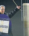
lonQ and other quantumcomputing stocks slid after Nvidia Chief Executive Jensen Huang played down the likely utility of the technology in the near- or medium-term.

A 'Hidden Force' Can Bring Mortgage Rates Down
Mortgage rates have been moving against home buyers in recent weeks. But there is a sliver of hope on the horizon.

Tencent Accelerates Buyback as Stock Falls
Tencent bought back the most number of shares in a single day Wednesday, a move that should support the share price after the Chinese tech giant's appearance on a Pentagon list triggered one of its heaviest selloffs in years.

Nvidia Needs to Appeal to Bigger Crowd
Investors remain hyperfocused on data centers despite big new efforts in gaming, self-driving cars and robotics

Trump's Vision Spells Trouble for NATO
Demands on military spending and ceding territory to U.S. risk undermining alliance

Travel Hacks Abound; Some Lead You Astray
Think before you try these social-media shortcuts at airports, hotels

Canada Faces Trade War With No Leader
Trudeau's decision to resign hampers plans amid threats of tariffs, takeover

Synopsis-Ansys Deal Gets a Boost
U.K. watchdog says remedies to address antitrust concerns appear reasonable

Coal-Mine Magnate Bet Big, Won Big
Low Tuck Kwong ignored warnings about the future of the grimy fossil fuel

The Shocking Loss That Turned Notre Dame Into a Contender
THE GREATEST MOMENTS in Notre Dame Fighting Irish history are the stuff of college football legend. There's Joe Montana's last-second heroics in the \"Chicken Soup Game.\" There's the fumble recovery that sealed the \"Catholics vs. Convicts\" showdown against the Miami Hurricanes. And there's Knute Rockne inspiring his players to \"win one for the Gipper\" in a 1928 upset of Army.

Shell Warns on Earnings, Cuts Production Outlook
Shell warned of significantly lower earnings in its integrated gas division and cut production guidance across its oil and gas segments.

Private Equity’s Role in Healthcare Blasted
Senate report says Wall Street investors are putting medical system at risk

U.S. Initial Jobless Claims Decline Slightly
Fewer Americans filed for initial jobless benefits last week, according to the Labor Department, a further sign that a softening labor market has continued to dodge a big uptick in job cuts.

The Coach Who Keeps Coming Up Short
Penn State's James Franklin is aiming to shed his reputation for big-game letdowns

Biden's Battered Legacy
Jimmy Carter spent nearly 45 years building a solid legacy following four years of an OK one-term presidency.