
Located within an emerging business district in the Indian city of Ahmedabad, Interstellar is a mixed-use, retail and office building with a striking frontal facade featuring terracotta-coloured, fly ash vertical sunbreakers.
more than a workspace
Designed by Mumbai-based Sanjay Puri Architects, the building, which has a built-up area of 17,461.52 sqm, was designed to be highly energy efficient, with passive cooling features that reduce the need for air conditioning. It also boasts screen walls, extensive landscaping, solar panels, and water recycling systems.
The building has 13 levels – two basement parking levels, retail spaces with sheltered arcades on the ground, first and second level, office spaces from the third to the ninth level, and a rooftop terrace tops it off.
The client, real estate developers Suvidha Projects, wanted the building to have maximal space for shops at the lower levels and offices on the upper levels. So the architects designed the office levels to be stepped back from the retail levels. This created space for a large, north-facing landscaped garden that extends from the fourth level, and that’s elevated 12 metres above the road. This large terrace, which features extensive greenery and outdoor sheltered seating areas, serves as a social area for the building’s office workers.
flexible floorplans
Bu hikaye d+a dergisinin Issue 128 sayısından alınmıştır.
Start your 7-day Magzter GOLD free trial to access thousands of curated premium stories, and 9,000+ magazines and newspapers.
Already a subscriber ? Giriş Yap
Bu hikaye d+a dergisinin Issue 128 sayısından alınmıştır.
Start your 7-day Magzter GOLD free trial to access thousands of curated premium stories, and 9,000+ magazines and newspapers.
Already a subscriber? Giriş Yap

Tailored For The Curious Explorer
The new Alma House at the New Bahru enclave reflects the collaborative spirit of a school environment.
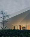
Eco And Egalitarian
Can a building represent a culture? Berrel Kräutler Architekten's sensitive renovation of the Embassy of Switzerland in Singapore stimulates discourse.

Building A Green Home
This semi-detached house by Zivy Architects explores passive tropical design, the delight in architecture and the issues of multi-generational living.

The Natural Balance
Inspired by the serene beauty of dewdrops, the Antao Collection by Villeroy & Boch transforms bathrooms into wellness sanctuaries, combining sustainability with timeless elegance.

Inspiring Creativity And Exploration
The new Hafary House at Lavender reflects the brand’s vibrancy and innovation, as well as provide an inspiring and engaging space for customers.
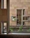
Home Is Where The Heart Is
A vacation house is reimagined for a multi-generational family to gather for holidays in the bucolic setting of Yongjia in Zhejiang, China.
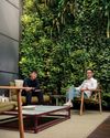
balancing act: nature and humanity
In this inspiration-led series, we asked Jay Liu and Alex Liu, co-founders of Right Angle Studio, to dream up a unique interior concept using mainly items from Space Furniture.

rethinking, remaking, reframing
Aoki Akio, the founder of DESIGNART TOKYO discusses the importance and legacy of Tokyo's eminent art and design event, particularly for young creatives.

rebuilding communities
Shift2024, the much-anticipated conference returns with a stellar line-up of prolific architects making their mark in Asian urban design.

unparalleled italian craftsmanship
Filippo Arnaboldi, Chief Executive Officer of Frette, tells us how this luxury lifestyle Italian brand is moving forward with times yet not forgetting about its existing legacy.