Intentar ORO - Gratis
Back to Basics with Black and White
Station Points
|International Artist
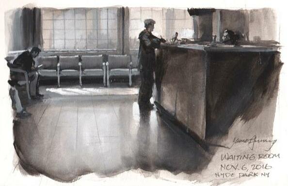
James Gurney shares basic painting exercises and applies them to field demonstrations in black and white gouache

Whether you're a newbie to painting or a seasoned pro, experimenting with basic principles can stimulate your thinking and focus your field approach. In this article, the first in a series, let's explore what we can accomplish with black and white. We'll discover how a patch of gray looks different when it's made of transparent black compared to an opaquely mixed gray. We'll see what insights we can glean from other simple studio exercises, and apply them to real-world situations.

REDUCE THE VARIABLES
When you visit an art supply store, you are confronted with a bewildering array of colors to choose from. If you're just learning to paint, or if you're trying out an unfamiliar painting medium, it helps to reduce the variables. That way you can concentrate on just one of the three dimensions of color, namely value, and you can deal with hue and chroma later. Let's start with the smallest combination of pigments possible: ivory black and titanium white.
Pure black and white is a completely valid choice on its own terms for creative expression, especially when you want a stark, moody feeling. And it has practical benefits. If you're trying out a new kind of paint, such as gouache or casein, you don't have to invest in the full color set. When you go on location, you only need to bring two tubes of paint, and they're ideally suited to painting in limited light environments.

EXERCISE 1: COMPARE TRANSPARENT AND OPAQUE
Esta historia es de la edición Station Points de International Artist.
Suscríbete a Magzter GOLD para acceder a miles de historias premium seleccionadas y a más de 9000 revistas y periódicos.
¿Ya eres suscriptor? Iniciar sesión
MÁS HISTORIAS DE International Artist

International Artist
Rugged Beauty
Heavy body acrylics, bristle brushes and palette knives lend a rough, yet serene quality to Karin Nelson's paintings
1 mins
February/March 2026

International Artist
Buildings with Character
In every issue of International Artist we feature a Painting Workshop from Richard Robinson, one of New Zealand's best artists
2 mins
February/March 2026

International Artist
The Director
Casting characters, designing sets and building props, visionary artist Ramón Hurtado brings his love of storytelling and academia into his artwork
3 mins
February/March 2026

International Artist
Words of Wisdom from the 2026 Art of the Portrait Faculty Artists
The Portrait Society of America is thrilled to celebrate another year dedicated to portraiture during our 28th annual The Art of the Portrait conference taking place in Atlanta, Georgia from April 9 to 12, 2026.
5 mins
February/March 2026

International Artist
Step by Step: Baroque Recycling
My painting Baroque Recycling stems from a deliberate collision between historical grandeur and contemporary urgency.
1 mins
February/March 2026

International Artist
Gentle Harmonies
Lena Rivo carefully chooses her colors before applying them to a high-grit paper to achieve her delicate pastels
1 min
February/March 2026

International Artist
Good Things Happen
Harley Brown's fascinating things no one else will tell you
5 mins
February/March 2026

International Artist
Crystal Clear
Elo Wobig demonstrates her approach for achieving depth and translucency in water scenes
1 mins
February/March 2026

International Artist
Light Is Everything
Calvin Liang delves into his process for capturing the warmth, energy and movement of light
1 mins
February/March 2026

International Artist
Shelter from the Storm
A new body of work by eco artist Jon Ching offers respite in a chaotic world
4 mins
February/March 2026
Translate
Change font size

