Intentar ORO - Gratis
iPhone 14 Pro
Mac Life
|December 2022
A significant makeover, that’s mostly skin deep

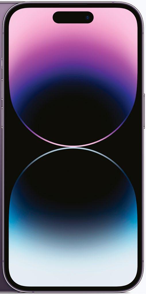
Outwardly, the new iPhone 14 Pro (and iPhone 14 Pro Max) share a lot in common with last year's iPhone 13 Pro model, though there are some key differences that set them apart, and a lot of these can be found in the 14 Pro's upgraded display. The first, and perhaps most obvious of these, is the new Dynamic Island which replaces the old, and somewhat universally-unloved notch. Dynamic Island is probably the biggest visual change to the way the front of the iPhone looks, but it's much more than just a prettier way of hiding the iPhone's front-facing camera and sensors, because, like a chameleon, it also changes and adapts to what's currently happening on your iPhone. For instance, if you're playing music, charging your device or connecting your AirPods, the bar will change size and display information specific to what's going on. It also reacts to your finger presses: if you tap the pill-shaped notch it'll take you to the app that's in focus, and if you hold down it'll shift size and shape to reveal more info about that app, and provide enhanced on-screen controls. It all sounds pretty in-your-face, but trust us - in action it's subtle enough to not be distracting, providing the right amount of feedback to make using your iPhone just that bit easier and more intuitive. If you don't want to interact with it, it doesn't get in the way.
Esta historia es de la edición December 2022 de Mac Life.
Suscríbete a Magzter GOLD para acceder a miles de historias premium seleccionadas y a más de 9000 revistas y periódicos.
¿Ya eres suscriptor? Iniciar sesión
MÁS HISTORIAS DE Mac Life

Mac Life
TerraMaster F4-425 NAS
Home or office four-bay network-attached storage
3 mins
March 2026

Mac Life
Satechi OntheGo 7-in-1 Adapter
Easily add more ports to your Mac, iPhone and iPad
2 mins
March 2026

Mac Life
BenQ ScreenBar Halo 2
Monitor lighting that's a sight for sore eyes
1 mins
March 2026
Mac Life
AI: WHAT YOU NEED TO KNOW
Al can be brilliant when put to proper use, but it also has some major downsides
11 mins
March 2026

Mac Life
Calibrate a MacBook Pro display
Can I calibrate my MacBook Pro 16-inch M3 Pro's XDR display, and if so, how?
1 min
March 2026

Mac Life
Edifier S880DB MKII
Great-sounding speakers with loads of connectivity
3 mins
March 2026

Mac Life
Search text in document images
I keep thousands of images of printed documents, and want to search their contents using Live Text, but Spotlight won't index them. How can I get it to work?
1 min
March 2026
Mac Life
No looking back at old icons
Can I customize the apps bundled in macOS Tahoe by giving them back their old icons?
1 min
March 2026

Mac Life
Set up multiple timers on iOS
Discover timers done right
2 mins
March 2026

Mac Life
Blue Prince
A multilayered inheritance challenge like no other
2 mins
March 2026
Translate
Change font size

